Cross processing
Also calledXpro, Cross-processed look, E-6 to C-41 cross process
Cross processing is a color technique, originally chemical, where footage is graded to mimic developing one film stock in the chemistry meant for another, producing shifted hues, blocked shadows and blown highlights instead of accurate color. It gives the image an unstable, chemically wrong feel that reads as edgy, nostalgic or off-kilter to the viewer.
What it tells
Directors reach for cross processing when a scene needs to feel unstable, heightened or slightly wrong, even if nothing in the story explains why. The distorted color acts as a mood signal: a party turning sour, a memory that does not fit reality, a world seen through a fevered or drugged state. Because it breaks the promise of natural color, viewers register discomfort or nostalgia before they consciously notice the grade.
How it is shot
Traditionally, a lab develops slide film (E-6) in negative chemistry (C-41), or the reverse. This scrambles how the three color layers are read, pushing highlights toward yellow-green, crushing shadows toward cyan or magenta, and boosting contrast and grain far beyond normal exposure latitude. On digital footage, colorists rebuild the look in a grading tool: a steep S-curve for contrast, independent shifts of the shadow and highlight color wheels in opposite directions, selective desaturation of midtones, and a grain overlay of 8 to 15 percent. Skin tones usually end up orange or sickly yellow, and clipped highlights lose detail on purpose.
When to use it
- A flashback or dream sequence that should feel chemically different from the rest of the film
- A party, rave or drug sequence where color should feel heightened and unreliable
- War or conflict footage meant to look raw, degraded and journalistic rather than polished
- A music video or fashion piece built around a retro, late-1990s editorial look
Not to be confused with
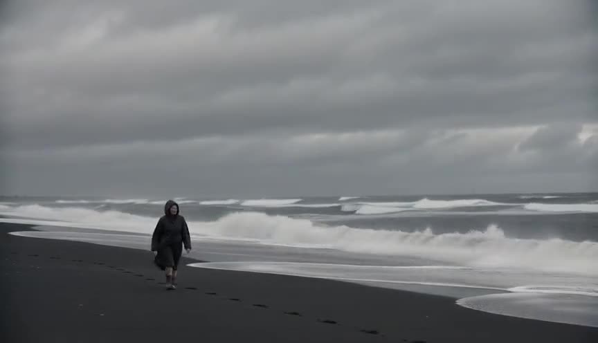
Bleach bypass keeps silver in the print to boost contrast and grain while colors stay mostly true; cross processing deliberately shifts hue balance, so shadows and highlights read as wrong colors, not just harsher ones.

Teal and orange is a controlled, symmetrical push of two complementary colors for a polished commercial look; cross processing is asymmetrical and unstable, closer to a mistake than a design choice.
In film
Three Kings (1999)
Newton Thomas Sigel shot desert combat material on Ektachrome reversal and had it cross processed in negative chemistry, creating blown highlights, crushed blacks, and a chemically harsh Gulf War image.
Buffalo '66 (1998)
Lance Acord shot on Ektachrome reversal and cross processed it, giving Gallo's drab Buffalo locations dense contrast, odd saturation, and a brittle snapshot quality.
Domino (2005)
Tony Scott and Dan Mindel used cross-processed reversal stocks among the film's aggressive photochemical tricks, making bounty-hunter montages and action scenes abrasive and color shifted.
The prompt
Name the color shift directly rather than the chemistry: say highlights pushed toward yellow-green, shadows pushed toward cyan or magenta, blown-out highlights, crushed blacks, heavy contrast, visible grain. Avoid vague words like 'vintage' alone, which models read as a soft sepia filter instead of this harsher, asymmetrical distortion. Mention that skin tones look slightly wrong (jaundiced or greenish) and keep the movement simple so the grade, not the camera, carries the shot.
The exact prompt that rendered the video on this page. Keep the description of the move, change the subject and the setting.
Cross processing color grade, static locked-off wide shot of a fishing harbor at dawn, weathered boats and coiled ropes on a wet concrete dock. Contrast is pushed hard: sky and water highlights blow out into a sickly yellow-green, while the shadows under the boat hulls shift toward cyan and magenta. Skin tones on a fisherman coiling a net look slightly jaundiced. Grain is heavy and visible, blacks are crushed with little shadow detail, and colors feel unstable rather than naturally balanced. Nothing moves except gulls crossing the frame and steam rising faintly off the water. No text.
Common mistakes
Treating it as a uniform tint
Cross processing shifts highlights and shadows in opposite, unrelated directions. Applying one single color tint across the whole image looks like a filter, not a chemical mismatch.
Keeping skin tones natural
Real cross processing almost always damages skin tones, pushing them toward orange, yellow or green. If faces still look healthy and neutral, the effect reads as a light grade instead of the real look.
Skipping the contrast and grain
The hue shift alone is not enough. Without blown highlights, crushed shadows and visible grain, the image looks like a color correction mistake rather than a deliberate cross process.
Frequently asked questions
What is cross processing?
It is a color technique, originally done by developing film in the wrong chemical process, that shifts hues unpredictably, blows out highlights and crushes shadows. Today it is mostly recreated digitally in color grading.
Is cross processing the same as a vintage filter?
No. Vintage filters usually add a soft, even sepia or faded warmth. Cross processing is harsher and asymmetrical, pushing shadows and highlights toward different, often ugly, colors at once.
Why do skin tones look strange after cross processing?
Because the technique scrambles how the film's color layers are read, midtones like skin often shift toward yellow, orange or green instead of staying neutral, which is part of the intended, slightly wrong look.
Can AI video tools generate a cross processed look?
Yes. Describing the specific highlight and shadow color shifts, contrast level and grain works well in prompts, and platforms like Imaginode can render this grade directly instead of requiring manual color correction afterward.