Teal and orange
Also calledOrange and teal, Blockbuster grade, Teal-orange look
Teal and orange is a color grading style that pushes skin tones and highlights toward orange while pushing shadows, backgrounds and blue-heavy elements toward teal. The complementary contrast isolates the human subject from the environment and gives the image a polished, high-contrast look that reads clearly even on a small screen.
What it tells
Directors reach for teal and orange because it does storytelling work without a single line of dialogue: warm skin against cool surroundings reads as a person holding on inside a hostile or artificial world. The color split creates instant depth and hierarchy, telling the eye where to look first. It also carries a psychological charge, orange feels alive and immediate, teal feels distant and technological, so the palette quietly sets up tension between the character and their setting before the story does.
How it is shot
Colorists build the look with secondary grading, isolating hue ranges rather than shifting the whole frame. Skin tones (roughly 20 to 40 degrees on a hue wheel) get pushed warmer and slightly desaturated, while shadows and cool-hued backgrounds get pushed toward 180 degrees, teal. This is done with hue vs hue and hue vs saturation curves in a program like DaVinci Resolve, layered over a base LUT. On set, gaffers help by lighting faces with warm tungsten or amber practicals and filling backgrounds with cool LED or moonlight gels, so the grade only has to enhance a contrast that already exists in the plate.
When to use it
- Sci-fi or tech settings where you want warm human presence against cold, artificial surroundings.
- Action sequences that need instant subject-background separation on a busy, cluttered frame.
- Trailers and posters where the palette must read as premium and cinematic at a glance.
- Any interior with mixed tungsten and daylight or LED sources you want to push into a clean contrast.
Not to be confused with
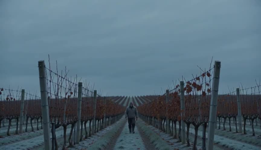
Cool blue grade tints the entire image toward blue with no orange counterpoint, giving a uniformly cold, isolated mood, while teal and orange keeps a deliberate warm zone for skin.
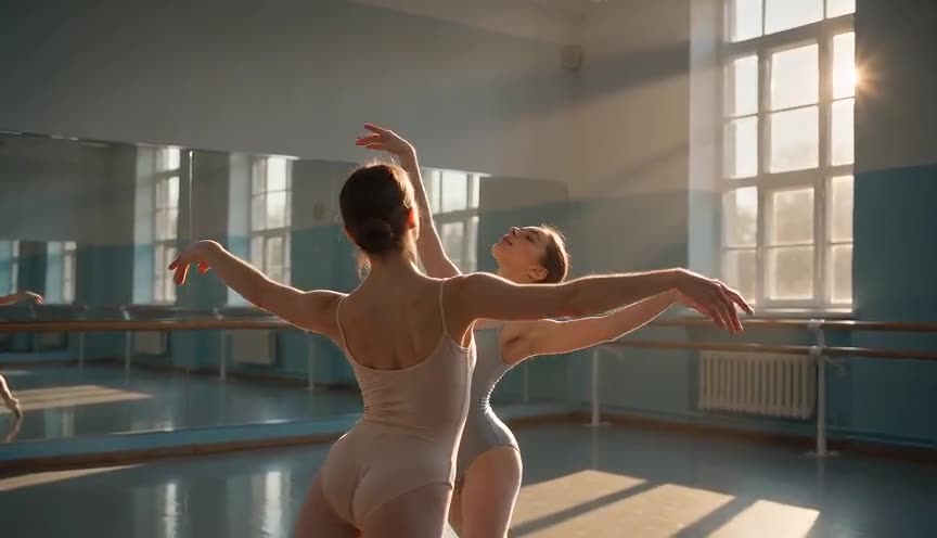
Split toning is the general technique of coloring shadows and highlights differently. Teal and orange is the most common, saturated, blockbuster-style version of that same idea.
In film
Transformers (2007)
Michael Bay's action scenes push metal and sky toward teal while faces and explosions stay orange, a look widely credited with popularizing the grade.
Mad Max: Fury Road (2015)
Desert daylight scenes push sand and fire toward orange while skies and night sequences lean cyan, creating the film's widely studied complementary palette.
The prompt
Name both colors and where each one lives: orange on skin, light fixtures or warm metal, teal on shadows, ambient light or coolant glow. Mention the light sources causing the split (amber practicals, blue-green corridor lighting) rather than just saying 'teal and orange grade,' since models render physical light better than abstract grading terms. Avoid asking for the whole frame to turn one color, that flattens the contrast the technique depends on. Keep the rest of the description neutral so the palette reads clearly.
The exact prompt that rendered the video on this page. Keep the description of the move, change the subject and the setting.
Teal and orange color grade in a curved space station corridor. A woman in a gray flight suit walks toward camera under warm amber ceiling strips that light her face and hands orange, while the metal walls, floor grating and background haze glow a deep teal from cool ambient panel light. Static wide shot, slight lens distortion, steady frame, four seconds, her warm-lit figure clearly separated from the cold teal environment behind her. No text.
Common mistakes
Tinting everything teal
Pushing the whole image toward teal with no warm counterpoint kills the separation the technique relies on and just looks like a cold color cast.
Ignoring skin tones
If skin drifts orange along with the shadows, faces look sunburned or plastic instead of warm, because the contrast collapses into one hue.
Overdoing saturation
Cranking both hues to maximum saturation turns the frame garish and cartoonish, a common mistake that reads as amateur grading rather than cinematic.
Frequently asked questions
What is teal and orange color grading?
It is a grading technique that pushes skin tones and warm highlights toward orange while pushing shadows and cool backgrounds toward teal, using complementary colors on the color wheel to separate subject from environment.
Why is teal and orange so common in movies?
Orange and teal sit opposite each other on the color wheel, so pairing them creates strong, readable contrast on any screen size, and warm skin against a cool background reliably draws the eye to the actor's face.
Does teal and orange work for every genre?
It fits action, sci-fi and thriller material well because it heightens contrast and drama, but it can feel heavy-handed in intimate dramas or period pieces that call for a more naturalistic, single-toned palette.
Can I get a teal and orange look from an AI video model like the ones on Imaginode?
Yes, describe the warm and cool light sources directly, for example amber lights on skin and teal ambient light on the background, since naming the physical light gets a more convincing result than naming the grade alone.