15 techniques
Color grading and film looks: setting the visual tone
Color grading and film look choices set the emotional temperature of a shot independent of what is actually happening in the story. A cool blue grade can make the same scene feel isolating that a warm amber grade would make feel comforting. Looks like bleach bypass, cross processing, or sepia borrow from specific film stocks and processes, carrying genre and era associations the audience recognizes instantly.
Pick a color treatment based on genre expectations and emotional target, then commit to it consistently across a scene or project. Teal and orange suits action and blockbuster contrast, desaturated looks suit bleak drama, hyper-saturation suits fantasy or music video energy. In AI prompts, name the specific grade or look rather than a vague color adjective like moody.
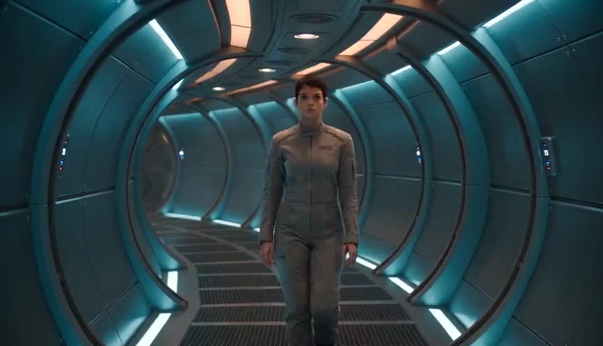
Teal and orange
Teal and orange is a color grading style that pushes skin tones and highlights toward orange while pushing shadows, backgrounds and blue-heavy elements toward teal. The complementary contrast isolates the human subject from the environment and gives the image a polished, high-contrast look that reads clearly even on a small screen.
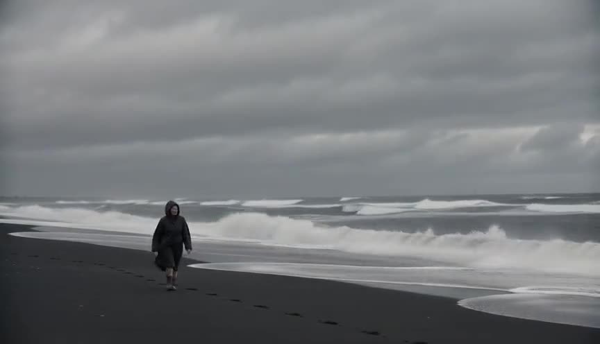
Bleach bypass
Bleach bypass is a film development process, or its digital imitation, that skips or partially skips the bleaching step so silver stays in the color image. It produces high contrast, desaturated color and a metallic, gritty sheen that reads as harsh and unforgiving to the eye.
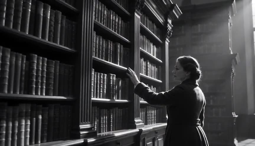
Black and white
Black and white is a color treatment that strips a shot of hue, rendering the image only in shades of gray from pure white to deep black. It forces the eye toward contrast, texture and composition instead of color, giving scenes a heightened, often timeless or documentary feel.
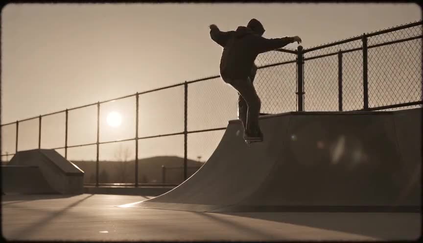
Sepia
Sepia is a color grade that strips out the full color palette and replaces it with a single warm, brownish monochrome, similar to an aged photograph or old print. It tells the viewer, without a word, that what they see belongs to the past, to memory, or to something already fading.
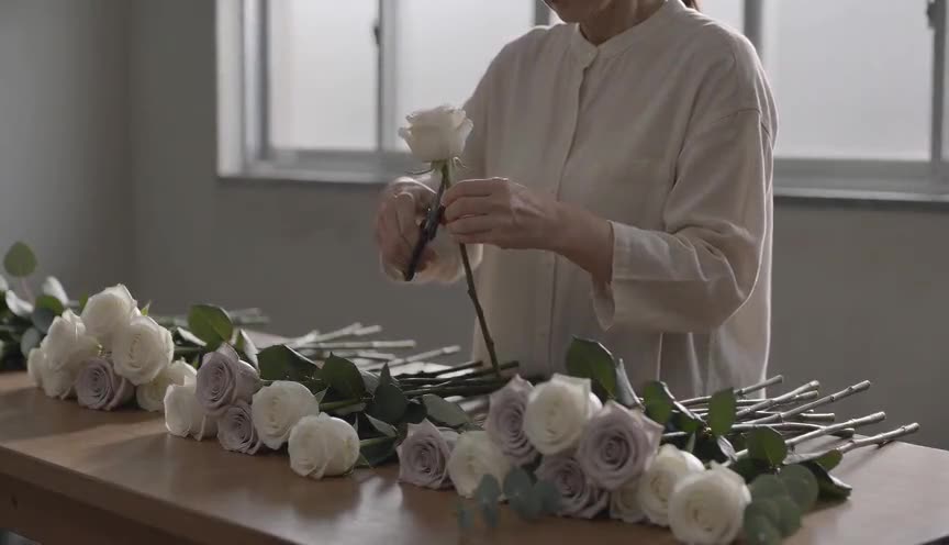
Desaturated look
The desaturated look is a color grade that reduces the intensity of hues in an image, pulling colors toward gray while keeping detail and contrast intact. It shifts the viewer's attention away from color and onto texture, light, and emotion, often reading as somber, clinical, or stripped of comfort.
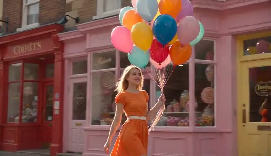
Hyper-saturated look
The hyper-saturated look is a color grade that pushes chroma well past natural levels, making reds, greens and blues read as bolder and more intense than the eye normally sees. It grabs the viewer's attention fast and signals heightened emotion, artificiality or a subjective, dreamlike state rather than plain realism.
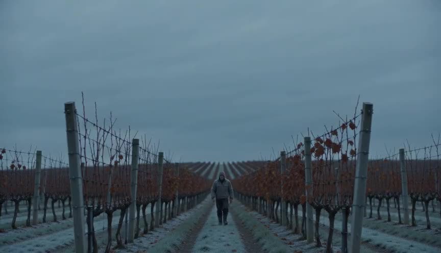
Cool blue grade
A cool blue grade is a color-correction pass that pushes the overall palette toward blue and cyan, desaturating warm tones like skin and wood while shadows and midtones take on a steel or teal cast. It signals cold, distance, danger or emotional detachment before a single line of dialogue is spoken.

Warm amber grade
Warm amber grade is a color grading style that pushes highlights, midtones and even shadows toward gold, honey and rust instead of neutral white or blue. It gives an image a sense of warmth, comfort and nostalgia, making a scene feel remembered and lived-in rather than clinically observed.
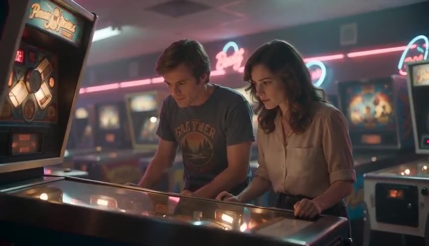
Faded film look
The faded film look is a color grade that lifts the black levels and mutes saturation to mimic aged, chemically degraded film stock. It reads to the viewer as memory, nostalgia, or the passage of time, distancing the image from the crisp present.

Cross processing
Cross processing is a color technique, originally chemical, where footage is graded to mimic developing one film stock in the chemistry meant for another, producing shifted hues, blocked shadows and blown highlights instead of accurate color. It gives the image an unstable, chemically wrong feel that reads as edgy, nostalgic or off-kilter to the viewer.
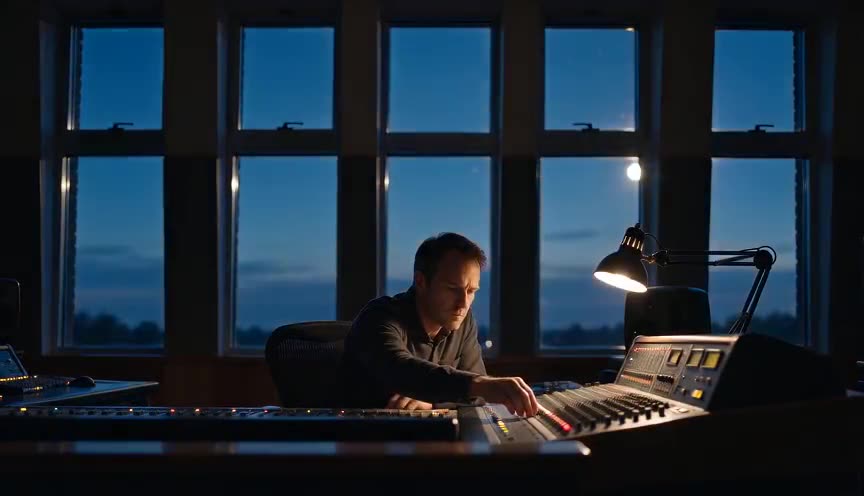
Day for night
Day for night is a technique for shooting night scenes during daylight hours, using underexposure, filters and color grading to make the footage read as nighttime. It lets a crew film large exterior night scenes without the cost, safety risks or scheduling limits of an actual night shoot.
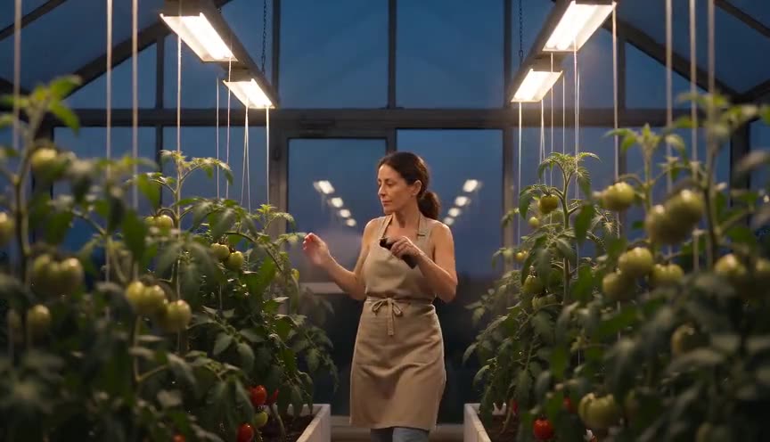
Tungsten balance
Tungsten balance is a white balance setting of about 3200K that renders warm tungsten light as neutral white, the way indoor bulbs and practicals were meant to look. When that same setting is used under daylight, every daylight-lit area shifts strongly blue, a mismatch cinematographers exploit for mood or correct with filters.
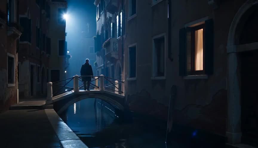
Moonlight gel
A moonlight gel is a blue-tinted lighting filter, usually a CTB gel, clipped over a light source to give it the cool, pale blue cast associated with real moonlight. It lets a cinematographer light a night scene with strong, controllable light while still reading to the eye as natural moonlight rather than a stage light.
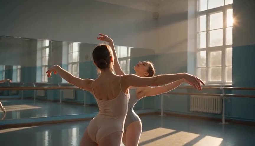
Split toning
Split toning is a color grading technique that applies one color tint to the shadows of an image and a different, usually complementary, tint to the highlights, leaving midtones closer to neutral. It gives flat footage a layered, dimensional feel and quietly tells the viewer which parts of the frame are cool and which are warm.

Overexposed look
The overexposed look is an exposure and color treatment where the image is pushed brighter than normal, driving highlights to pure clipped white and softening shadow detail. It reads to the viewer as glare, heat, memory, or a moment too intense or too bright to hold onto.
Frequently asked questions
What is the teal and orange look and why is it common?
Teal and orange grading pushes shadows toward teal and skin tones toward orange, creating strong complementary contrast that reads well on screens of any size. It became a blockbuster standard because it separates subjects from backgrounds clearly and consistently.
What is the difference between desaturated and black and white looks?
Desaturated looks reduce color intensity while keeping some hue information, producing a muted but still colored image. Black and white removes color entirely, relying on tonal contrast and shadow shape alone to carry the image.
How do I get a consistent film look in AI generated video?
Name a specific, recognizable look in the prompt, such as sepia, bleach bypass, or cross processing, rather than general terms like vintage or cinematic. Specific process names carry consistent visual rules the model can apply reliably.