Starting a business
A freelancer who is just starting needs a card before having a full identity: two proposals in five minutes beat a free template everybody recognises at a glance.
Two Text nodes carry your exact details, two Image nodes draw the card flat, one light and one dark, text included. Workflow visible here, no account needed.
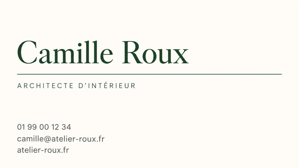
Real workflow: the details of an invented interior architect, two styles, two models. The light card is drawn by GPT Image 2.5 Sunburst, the dark one by Nano Banana Pro.
At a glance
A business card is five lines of text and one graphic idea. The graphic idea takes an image model a few seconds; the five lines come out right on one condition, that you hand them over word for word, between quotes, with a ban on writing anything else.
That is the whole method of this workflow, and it is also what separates it from a logo generator: here the text is the deliverable. Both prompts in the demo carry the same details and two opposite art directions, an ivory serif card and a navy card in capitals.
Two models, because they are not equal at the same exercise: GPT Image 2.5 Sunburst writes perfectly on a light background, Nano Banana Pro holds very dark flat colours better. A full run costs twenty-eight credits.
These are the files of the workflow above, exactly as the models produced them, unretouched. The starting point is shown when there is one.
Render
Freelancers, tradespeople and small teams who need a clean card by tomorrow morning, with no studio and no layout software.
Your details written exactly as they must be printed: name, job title, phone, email, website, one per line.
Write your details
Name, job title, phone, email, website, one per line and between quotes. This is the part that is not up for negotiation: the model copies what you write.
Forbid everything else
No other word, no invented logo, no QR code, no address. Without that sentence the model fills the gaps with plausible, wrong details.
Ask for a flat card
Straight on, no perspective, no hand, no desk: a card held in a photo looks lovely and is useless to a printer.
Re-read character by character
The number, the at sign, the domain name. A card is printed a thousand times: this is the cheapest check in the whole project.
The same canvas, tuned for different needs: each variation is two or three lines of prompt away.
A freelancer who is just starting needs a card before having a full identity: two proposals in five minutes beat a free template everybody recognises at a glance.
The same person, the same details, two opposite moods: it is the best way to decide, because you finally compare something other than colours on a screen.
A clean image beats a description over the phone: the printer sees the hierarchy, where the name sits, the spirit of the typography, and leaves with the right idea.
A trade show, a market, a conference: a clean card printed the day before is enough, and it can pick up the colours of the event poster.
If the identity already exists, the logo generator makes the mark and this page applies it to the card, with the same colour codes copied into the prompt.
Same format, same style, different text: a card slipped into a customer parcel is made exactly like a business card, and costs the same.
Without the exact words between quotes it writes a plausible name, a plausible number and a website that does not exist. On a business card, plausible means wrong.
A card held in a hand, lying on marble, with a soft shadow: lovely in a portfolio, useless to print. The flat card is the deliverable.
Two addresses, a QR code, four social handles: the more text there is, the more the model slips, and the less readable the card becomes. Five lines, not six.
One wrong character in an email address cancels the point of the card. Proofreading is faster than generating, and it is what decides.
It is a high resolution image, with no bleed and no crop marks. It works very well for an online print run or to give a printer a direction, not as a replacement for a vector file.
The demo prompt bans any logo to avoid fakes. To add yours properly, keep your own file and drop it in the Retouch node, rather than hoping the model redraws it identically.
Duplicate an Image node and ask for the back with the same colours: one sentence, one pictogram, nothing else. A crowded back reads even worse than a crowded front.
Twenty-eight credits for the two styles in the demo: nine credits for the light card in high quality, nineteen for the dark card on Nano Banana Pro. One more style costs the price of one image.
Because they do not pass the same test. Measured on 18 September 2026: Sunburst writes flawless text on the ivory card, but on a navy flat background it put black smears in the middle of the frame three times. Nano Banana Pro renders the flat colour clean.
The images come out in 16:9, very close to the ratio of a standard 3.5 by 2 inch card. For a European 85 by 55 millimetre format, plan on a small crop.
Yes, the model copies what you give it, in any Latin alphabet language. For a non Latin script, check the result character by character before printing anything.
Duplicate the Text node and change the name: that is the case of a whole team, where only the first line changes from one card to the next.
Create a business card with AI
Use this workflowFree account, no card required. The workflow opens pre-filled in your canvas.
 GPT Image 2.5 Sunburst
 Nano Banana Pro
 Seedream 5 Pro