The minimal card
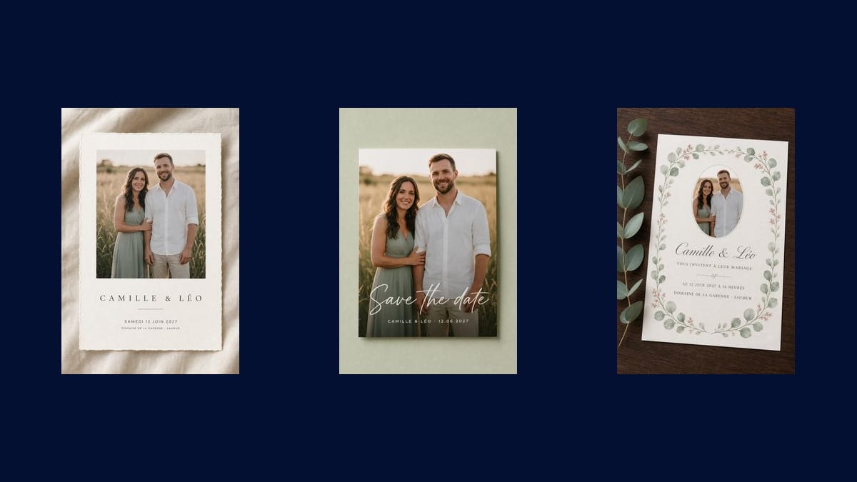
Photo at the top, names in fine capitals, a rule, the date and the venue very small. It is the most timeless of the three layouts, and the one that best forgives an average photo.
Your couple photo goes into three Image nodes that turn it into three invitations, with the names, the date and the venue written cleanly into the image: a minimal card, a full page save the date, a floral frame.
The real workflow: the couple photo wired to three GPT Image 2 nodes, one layout per node. The three cards are the demo's own, names and date written into the image.
At a glance
A wedding invitation comes down to four lines: two names, a date, a venue. The rest is layout, and that is precisely what an online print shop charges you for. This workflow starts from your couple photo and returns three complete cards, wording included, which you only have to proofread before sending them to print.
The three layouts look nothing alike: a minimal ivory card with the photo at the top and the names in fine capitals, a full page save the date where the photo fills the whole card, and a card framed with watercolour eucalyptus with the photo as a medallion. Three families of taste, three ways of announcing the same thing.
Here the text IS the product: badly formed names make a card you cannot use. So the workflow runs on GPT Image 2, the model in the catalogue that writes a short line best, accents included, as the article on hands and text explains. The three cards cost twenty-four credits.
These are the files of the workflow above, exactly as the models produced them, unretouched. The starting point is shown when there is one.
Starting point
Render
Choose a sharp, bright photo
The two of you, framed to mid-thigh, outdoors if possible, with nobody else in shot. This is the photo the three cards reuse, each one in its own way.
Replace the wording between quotes
Names, date, venue: everything between quotes in the instruction is copied into the image as it stands. Write them exactly as you want them, accents and ampersand included.
Keep it short
A card carries four lines, not a paragraph. The more text you add, the more the model distorts the letters: the practical details go on a separate insert or on your website.
Generate, then proofread letter by letter
"Generate all" produces the three cards. Then reread every name and every figure of the date on the render: it is the only check that matters before printing.
The same canvas, tuned for different needs: each variation is two or three lines of prompt away.
Photo at the top, names in fine capitals, a rule, the date and the venue very small. It is the most timeless of the three layouts, and the one that best forgives an average photo.
The photo fills the whole card and the text sits over it in handwriting. It goes out a year ahead, often by message, and it needs only two pieces of information.
A border of eucalyptus and dried flowers painted in watercolour, the photo as a medallion in the centre. It is the warmest version, and the closest to wedding stationery.
Same look, different wording: take one of the three cards and change the lines between quotes to announce the meal, the timings or the directions to the venue.
The same layout with a photo from the ceremony and two lines of thanks. Guests get a card that echoes the invitation, and the whole set holds together.
Nothing in the workflow is specific to a wedding. Change the photo and the four lines, and the mechanics stay the same for any printed announcement.
Beyond four or five lines, the letters distort and the card becomes unusable. The practical detail goes on a separate insert, never on the main invitation.
Without them, the model rephrases your names or translates the date. Whatever sits between quotes is copied as it stands: that is the rule the whole workflow rests on.
If there are three people in the photo, there will be three on the card, and often one more. Give a photo where it is just the two of you.
One missing letter on a hundred copies costs a hundred copies. Reread every name and every figure on the render, not on the instruction.
On a short line given between quotes, yes, accents included, as the three demo cards show. Read it again anyway: an image model can always get a letter wrong.
On an invitation the photo is a medallion and not a studio portrait, and that is what this model does well. If the likeness matters more than the text, switch the node to Nano Banana Pro.
Yes, bearing in mind that a printer often asks for a bleed margin and a precise resolution. The Enhance node enlarges the card without reinventing the text, which is enough for most formats.
Twenty-four credits, eight per card. The standard tier is enough: probed on 10 September 2026, the high tier does no better on the text or on the faces and costs almost four times more.
Yes, describe it in the instruction: ivory or white paper, charcoal or terracotta ink, pink or blue flowers. The photo itself stays the one in the Media node.
The renders are in portrait format, close to 10 by 15 centimetres. For a precise format imposed by your printer, crop the render or ask for the margins before generating.
Yes, in any of the site's fourteen. Give the line in the language you want and state it in the instruction, exactly as the demo does in French.
No. A sharp phone photo, taken at the end of the day against a simple background, is more than enough once it is reduced to the size of a medallion on the card.
Design your wedding invitation with AI
Use this workflowFree account, no card required. The workflow opens pre-filled in your canvas.
 GPT Image 2
 Nano Banana Pro
 Recraft V4.1