Desaturated look
Also calledmuted color grade, washed-out look, low-saturation grade, drained color
The desaturated look is a color grade that reduces the intensity of hues in an image, pulling colors toward gray while keeping detail and contrast intact. It shifts the viewer's attention away from color and onto texture, light, and emotion, often reading as somber, clinical, or stripped of comfort.
What it tells
Directors reach for desaturation when they want color itself to feel absent, as if the world has lost its warmth. It flattens the emotional cushion that saturated color provides, making grief, trauma, poverty, or bureaucratic coldness feel more immediate. Because the eye still reads shape and light without the distraction of vivid hue, desaturation directs focus toward faces, gesture, and composition. It also signals a break from a film's normal palette, a flashback, a memory, or a descent into a harsher reality, without needing a title card to say so.
How it is shot
In camera, desaturation starts with flat lighting and muted production design: gray walls, neutral wardrobe, overcast or diffused light that avoids strong color casts. In the grade, colorists pull the saturation slider down globally, often to 20 to 50 percent of normal, or target specific hues, keeping skin tones closer to normal while background colors drop further, using a color wheel or HSL qualifier. Contrast is usually kept high or even boosted so the image does not go flat and gray all at once; lifting the black point slightly can add a bleached, filmic quality. Some cinematographers achieve part of the look in camera with a filter or specific stock, reducing reliance on post.
When to use it
- Use it for flashbacks or memories that need to feel drained of the present's vividness.
- Use it to show trauma, illness, or grief without leaning on dialogue to explain the feeling.
- Use it in dystopian or bureaucratic settings where a lack of color signals a lack of freedom.
- Use it to unify footage shot in mismatched light without leaning into a stylized color grade.
Not to be confused with
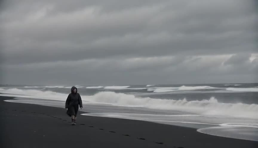
Bleach bypass keeps the silver layer during film processing, producing a specific high-contrast, gritty look with some color retained. Desaturation is simpler: any method of lowering saturation, with contrast and grain handled separately.
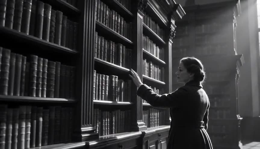
Black and white removes color entirely, leaving only luminance. Desaturation is a matter of degree: colors are muted, not eliminated, so a faint blue or ochre cast can still read under the gray.
In film
Children of Men (2006)
Uses a near-permanent desaturated, olive-gray palette to make its near-future Britain feel worn out and hopeless.
The Road (2009)
Strips almost all color from its post-apocalyptic landscapes, leaving flat grays and browns that match the story's despair.
Traffic (2000)
Soderbergh gives the Ohio storyline a heavily desaturated, blue-gray grade to visually separate it from the film's other threads.
The prompt
Tell the model explicitly to remove color: desaturated, muted color palette, near-monochrome with faint color, or colors drained to gray. Specify what stays, such as skin tones slightly warm while everything else turns gray-green or gray-blue. Mention flat, overcast, or diffused light rather than bright colored key light, since strong colored light fights desaturation. Avoid words like vibrant, colorful, or saturated anywhere in the prompt, even to negate them, since models often ignore negation and latch onto the adjective. Pair with high contrast for a grittier version, or soft light for an elegiac one.
The exact prompt that rendered the video on this page. Keep the description of the move, change the subject and the setting.
Desaturated look: a static locked-off shot inside a small flower shop, framed at eye level on a middle-aged woman arranging white and pale pink roses at a wooden counter. The entire image is drained of color, skin tones a muted beige, the flowers a faint gray-pink, green leaves reduced to pale olive, walls flat gray. Soft, even overcast light comes through a large front window, casting no strong color cast and few shadows. The woman's hands move slowly, trimming stems with scissors, while the camera holds perfectly still for the full four seconds. No text.
Common mistakes
Confusing desaturation with dullness
Pulling saturation down without raising contrast leaves the image flat and lifeless; the grade needs shape from light and shadow to still read as intentional, not broken.
Desaturating skin unevenly
Dropping saturation globally can turn skin tones sickly green or gray; skilled colorists protect flesh tones with a mask or vectorscope check before pulling the rest of the palette down.
Fighting it with colored light
Shooting under strong practical or neon light and then trying to desaturate in post creates muddy color casts instead of a clean gray; plan the lighting on set to match the intended grade.
Frequently asked questions
What is the desaturated look?
It is a color treatment that reduces the intensity of colors in an image, pulling them toward gray while keeping detail and contrast, so the viewer's attention shifts from color onto texture, light, and emotion.
How much should I lower saturation for a desaturated look?
There's no fixed number; most desaturated grades sit between 20 and 60 percent of full saturation. Push further for a near-monochrome, clinical feel, or keep it lighter to retain a subtle color mood.
Does desaturation mean black and white?
No. Black and white removes color entirely, while desaturation dials it down and can stop anywhere along that scale, letting a faint hue survive under the gray.
Can I get a desaturated look with an AI video model like on Imaginode?
Yes. Naming desaturated or muted color palette directly in the prompt, describing flat overcast light, and avoiding words like vibrant usually gets a clean result on platforms such as Imaginode.