Hyper-saturated look
Also calledhypersaturation, boosted color grade, vivid grade
The hyper-saturated look is a color grade that pushes chroma well past natural levels, making reds, greens and blues read as bolder and more intense than the eye normally sees. It grabs the viewer's attention fast and signals heightened emotion, artificiality or a subjective, dreamlike state rather than plain realism.
What it tells
Directors reach for hyper-saturation when they want the image to feel charged, almost electric, so the audience reads the world as intensified rather than documentary. It works for euphoria, danger, drug states, fever dreams or a character's skewed perception, and it also brands a film's identity instantly, from candy-colored comedies to neon-drenched thrillers. Because it departs from how eyes actually see color, it always carries a point of view: something in the scene, or someone's mind, is turned up.
How it is shot
On set, colorists push saturation and vibrance in the grade, often 20 to 60 percent above baseline, while protecting skin tones with secondary color correction so faces do not turn plastic. Cinematographers help by lighting with strong colored sources, gels on tungsten or LED fixtures, and by choosing production design with bold, pure hues (reds, cyans, magentas) rather than muted tones, since saturation amplifies what is already colorful. Camera settings matter too: some shoot with picture profiles set to higher color matrix values, or use vivid camera LUTs on set for reference. In post, saturation is often paired with contrast boosts and sometimes a slight highlight roll-off so the brightest colors do not clip into flat blocks.
When to use it
- A character enters a euphoric, drug-altered or dreamlike mental state the audience should feel physically
- A nightlife, club or neon urban setting needs to read as electric and artificial rather than naturalistic
- A comedy or fantasy world benefits from a candy-colored, heightened visual identity distinct from reality
- A key emotional beat, like a first kiss or a reveal, needs a sudden jolt of visual intensity
Not to be confused with
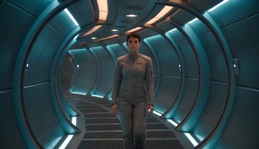
Teal and orange shifts hue balance toward two complementary tones for a cinematic blockbuster feel, while hyper-saturation pushes overall chroma intensity across all colors, not just two poles.
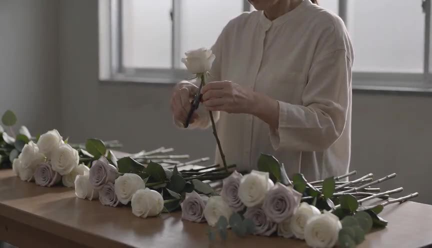
Desaturated look strips color intensity down toward gray for bleakness or realism, the opposite instinct from hyper-saturation, which amplifies color to create energy or artificiality.
In film
Amelie (2001)
Uses rich reds and greens pushed past natural levels to build a whimsical, storybook version of Paris.
Enter the Void (2009)
Neon and ultraviolet colors are pushed to extremes to render a drug-fueled, out-of-body subjective view.
Spring Breakers (2012)
Saturated pinks and neon lighting create a hypnotic, party-fueled dreamscape throughout the film.
The prompt
Name the saturation level directly (vivid, hyper-saturated, boosted chroma) and specify which colors intensify, since AI models respond better to concrete hues than vague terms like colorful. Mention the light sources creating the color (neon, colored gels, LED panels) so the model ties saturation to a physical cause rather than a flat filter. Avoid asking for both hyper-saturation and desaturation cues in the same prompt, and skip words like cinematic grade alone since they are too generic to move the chroma.
The exact prompt that rendered the video on this page. Keep the description of the move, change the subject and the setting.
Hyper-saturated look. A candy shop street at noon: bright red, electric pink, lemon yellow and turquoise storefronts, a woman in a vivid orange dress walks by holding a bunch of bright balloons, every color pushed to the maximum, intense and almost unreal, like a vivid music video. Slow tracking shot. No text.
Common mistakes
Skin turns plastic
Pushing global saturation without protecting skin tones makes faces look sunburned or artificial, breaking believability even in a stylized scene.
Muted production design fights the grade
Hyper-saturation needs bold source colors to amplify, applying it to a gray, neutral set just adds noise instead of intensity.
Clipped color blocks
Extreme saturation without a highlight roll-off crushes bright hues into flat, banded blocks, losing texture in the brightest areas of the frame.
Frequently asked questions
What is the hyper-saturated look?
It is a color grading style that increases chroma well beyond natural levels so colors read as bold, intense and sometimes artificial, used to signal heightened emotion, altered states or a stylized world rather than everyday realism.
When should I avoid hyper-saturation?
Avoid it for documentary style, somber drama or any scene that needs to feel grounded and truthful, since the intensified color immediately signals artificiality and pulls viewers out of a naturalistic mood.
Does hyper-saturation always mean neon colors?
No, it can apply to any color palette, warm earth tones, pastel candy colors or deep jewel tones, the key trait is chroma pushed above natural levels, not a specific hue family like neon.
How do I get a hyper-saturated look from an AI video model?
Describe the saturation level explicitly and name the colored light sources causing it, tools like Imaginode respond well to concrete color and lighting cues rather than a single vague style word.