Tonal contrast
Also calledvalue contrast, light-dark contrast, brightness contrast
Tonal contrast is the deliberate difference in brightness and darkness between areas of a frame, used to separate a subject from its background and direct the eye toward the shot's focal point. It tells the viewer where to look before they consciously register anything else in the frame.
What it tells
Directors reach for tonal contrast when they want the eye to obey the story, not wander the frame. A face lit bright against a black room feels exposed, hunted, or important; a dark figure against a pale sky feels ominous or small. Because it works on brightness alone, tonal contrast reads instantly, even at a glance or in a busy, cluttered set, which makes it one of the fastest ways to build hierarchy and mood without a single word of dialogue.
How it is shot
Tonal contrast is built with light, exposure, and choice of surfaces working together. A cinematographer isolates one hard key source (often a single lamp or window) and kills or dims ambient fill so the ratio between highlight and shadow climbs, sometimes to 8:1 or higher on a light meter. Wardrobe and set dressing reinforce it: a pale subject against dark walls, or a dark silhouette against a bright sky. Exposure is set to protect the highlight on the subject, letting the background fall into near-black or near-white with little detail. In the grade, colorists push contrast further by lifting or crushing the shadow curve, deepening blacks without muddying the subject's exposure.
When to use it
- When you need to isolate a lone subject in a large, cluttered, or busy environment.
- When building dramatic tension or moral ambiguity through visual weight rather than dialogue.
- When grading a scene for a noir, thriller, or other high-stakes genre look.
- When silhouette or rim light alone will not read clearly against a similarly toned background.
Not to be confused with
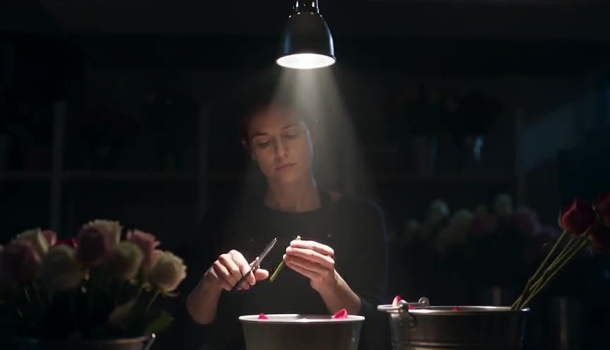
Chiaroscuro is a specific lighting style built entirely from strong tonal contrast, usually with a single hard source. Tonal contrast is the broader principle; it can come from lighting, wardrobe, set dressing, or grading, not only from dramatic light and shadow.
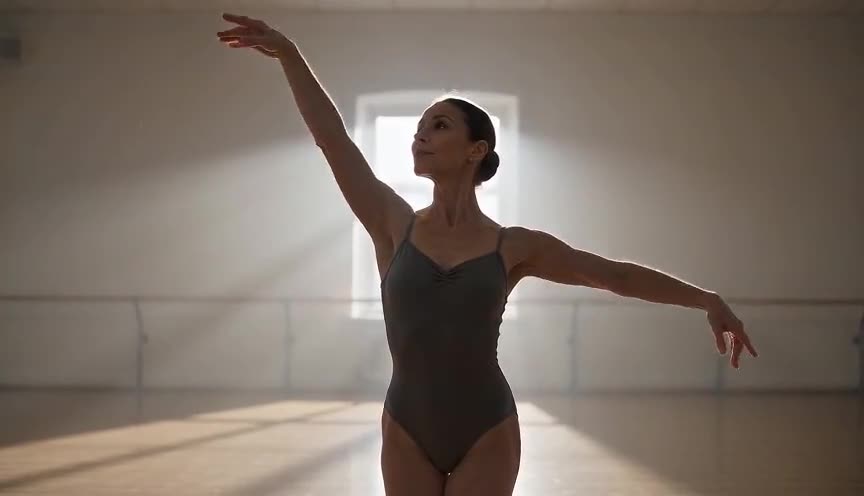
Figure-ground separation is about a shape or silhouette reading clearly against its background, by any means. Tonal contrast is one of the main tools used to get that separation, working through brightness values rather than color, texture, or focus.
In film
The Godfather (1972)
Gordon Willis lights interiors with deep pools of shadow so faces emerge from near-black backgrounds, isolating power and secrecy.
Sin City (2005)
Nearly the entire film is built on extreme black and white tonal contrast, with figures and objects picked out in pure white against pure black.
There Will Be Blood (2007)
Robert Elswit stages night scenes at the oil camp as bright fire and lantern light against total blackness, isolating the protagonist from the dark.
The prompt
Name the light and dark values explicitly: a bright subject against a dark background, or a dark silhouette against a bright sky, and say where the single light source sits. Words like hard light, single source, deep shadow, and near-black background push the model toward real contrast. Avoid vague terms like moody or cinematic alone, and avoid asking for even, soft, or ambient lighting, which flattens the effect the model is trying to render.
The exact prompt that rendered the video on this page. Keep the description of the move, change the subject and the setting.
Tonal contrast: a static locked-off medium shot inside a dim car repair garage, most of the frame swallowed in deep black shadow except a single overhead work lamp that throws a hard cone of bright light onto a mechanic in a pale gray jumpsuit crouched beside an open engine bay. The mechanic's skin and clothing read almost white against the surrounding blackness, while tools and tires in the background stay barely visible silhouettes. The camera holds perfectly still for the full four seconds, the light source and exposure fixed, so the eye is pulled straight to the bright figure against the dark garage. No text.
Common mistakes
Flat fill light
Adding too much fill or ambient light kills the ratio between highlight and shadow, leaving a muddy image with no clear point of focus.
Contrast without hierarchy
Scattering bright and dark patches evenly across the frame confuses the eye instead of guiding it to a single subject or focal point.
Crushed shadow detail
Pushing blacks too far in the grade clips all detail in the dark areas, so shadows feel like flat empty gaps rather than a sense of depth.
Frequently asked questions
What is tonal contrast?
Tonal contrast is the use of light and dark values within a frame to separate a subject from its surroundings and pull the viewer's attention to a specific point, independent of color.
How is tonal contrast different from color contrast?
Tonal contrast works on brightness alone and reads even in black and white, while color contrast (like teal and orange) relies on hue differences that can exist even when brightness values are similar.
Does tonal contrast work in black and white footage?
Yes, it works especially well in black and white, since brightness is the only variable left for the eye to read once color is removed, which is why noir and monochrome films lean on it heavily.
How do I get strong tonal contrast from an AI video model?
Describe an explicit light source, a bright subject, and a dark background in the same sentence, since models like the ones on Imaginode respond to concrete lighting language far better than mood words alone.