25 techniques
Composition: arranging the frame to guide the eye
Composition is the arrangement of everything inside the frame, and it decides where a viewer's eye lands first, second, and last. Rule of thirds and the golden ratio offer reliable starting grids, leading lines pull the eye toward a subject, and negative space gives a subject room to breathe or feel isolated. These are not rules to follow blindly, they are tools for directing attention on purpose.
Choose a composition strategy based on what you want the eye to notice and in what order. Use symmetry for calm or formal moments, asymmetry and diagonals for tension and movement, layered depth when foreground and background both matter. In AI video prompts, composition terms help the model place subjects with intention instead of centering everything by default.
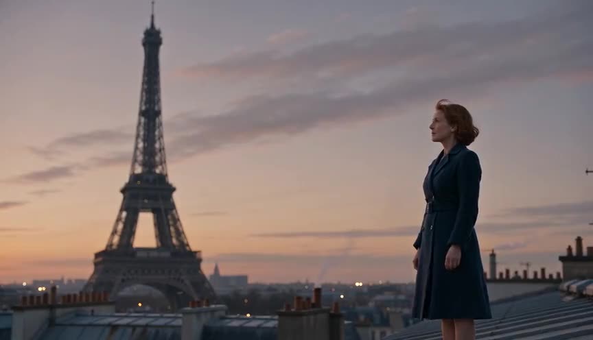
Rule of thirds
The rule of thirds is a composition guideline that divides the frame into a 3x3 grid and places key subjects along the grid lines or their four intersections rather than at the center. It creates a more balanced, dynamic image that guides the eye and leaves room for the subject to breathe.

Golden ratio
The golden ratio is a compositional guide based on the proportion 1.618:1, often drawn as a spiral of shrinking squares to show where the eye naturally settles in a frame. It places the subject at that focal point instead of dead center, giving the image a sense of organic balance rather than a rigid, mechanical layout.

Centered composition
Centered composition places the main subject on the vertical (and often horizontal) center line of the frame instead of at a third. It reads as formal, still, and direct, pulling the eye straight to the subject with no competing pull to either side.

Symmetry
Symmetry is a composition technique that places the subject on the frame's central vertical axis so the left and right halves mirror each other. It reads to the viewer as balanced, orderly and often formal, and it can also feel controlled, artificial or unsettling when pushed too far.
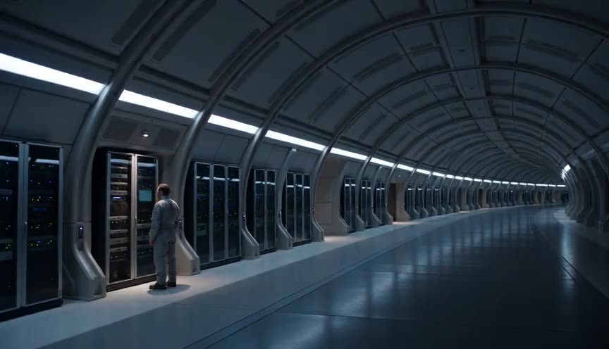
Asymmetry
Asymmetry is a composition strategy that places visual weight unevenly across the frame instead of balancing it on a central axis. It creates tension, unease or dynamic energy, pulling the viewer's eye toward the imbalance rather than letting it settle.

Leading lines
Leading lines are physical lines within the frame, roads, rails, shorelines, fences, that guide the viewer's eye toward a specific point of interest or into the depth of the image. They give a shot direction and a clear path for attention, making the composition feel organized rather than scattered.
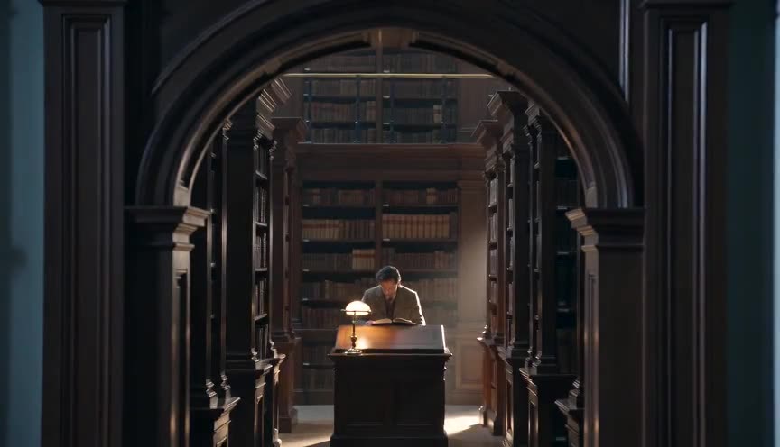
Frame within a frame
Frame within a frame is a composition technique where an element inside the scene, such as a doorway, window, arch or mirror, encloses the subject in a secondary border. It isolates the subject, adds depth, and can suggest confinement, observation or a story told within a story.
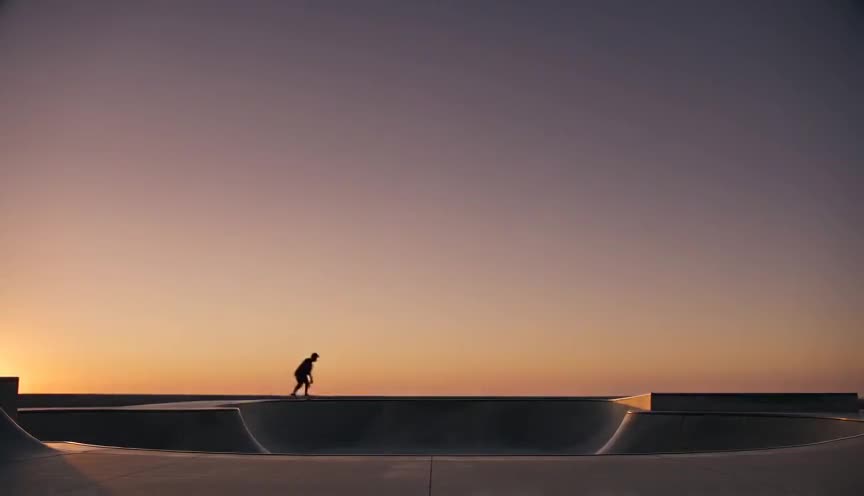
Negative space
Negative space is a composition technique that surrounds a small subject with a large area of empty, uncluttered background. It isolates the subject, directs the eye immediately, and often reads as loneliness, scale, or calm.

Foreground interest
Foreground interest is a composition technique that places an object, person, or texture close to the camera in the front layer of the frame. It adds depth, scale, and a sense of place, pulling the viewer's eye through the image toward the subject further back.
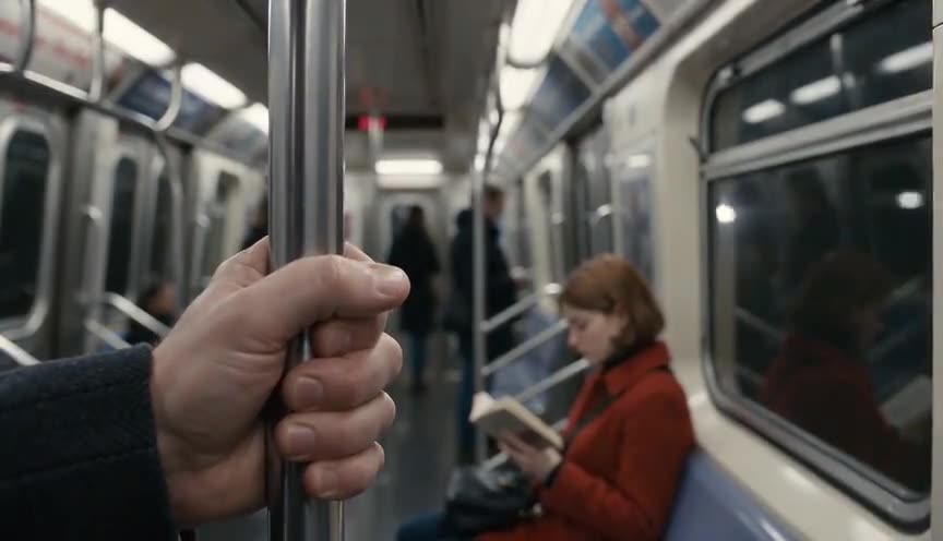
Layered depth
Layered depth is a composition technique that arranges distinct visual elements in the foreground, midground and background of the frame to build a sense of three-dimensional space. It gives the eye a path through the image and makes a flat screen read as a real, inhabited place.

Diagonal composition
Diagonal composition arranges the strongest lines of a shot, a road, a staircase, a body, so they cross the frame at an angle rather than running horizontally or vertically. It injects energy and instability into an image, pulling the eye through the frame and signaling movement, imbalance or tension.

Triangular composition
Triangular composition arranges the key elements of a frame so their outlines suggest a triangle, usually with a wide stable base and a narrower apex. It gives the image a sense of balance, stability and quiet order, guiding the eye upward through the scene.

Headroom
Headroom is the amount of empty space left between the top of a subject's head and the top of the frame. Too much makes a person look small and adrift; too little crowds them and reads as cramped or about to be cut off.

Lead room
Lead room is the empty space left in front of a subject on the side they are moving toward or looking at, rather than behind them. It reads to the eye as room to move or think, so the frame feels balanced instead of cramped.
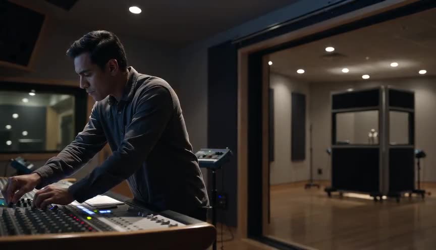
Short siding
Short siding is a framing choice that places a subject so their gaze or body faces the narrow side of the frame, leaving little space to look or move into, instead of the open side. It reverses the usual comfort of lead room and makes the viewer feel the frame is working against the subject.

Visual weight
Visual weight is the perceived importance or heaviness that an element carries within a frame, created by factors such as size, contrast, color, isolation and sharpness rather than actual mass. It tells the viewer where to look first and how balanced or unbalanced the rest of the composition feels.

Repetition and pattern
Repetition and pattern is a composition technique that arranges identical or near identical visual elements, such as columns, windows or figures, in a regular sequence across the frame. It gives the eye a rhythm to follow and makes any break in that rhythm immediately noticeable.
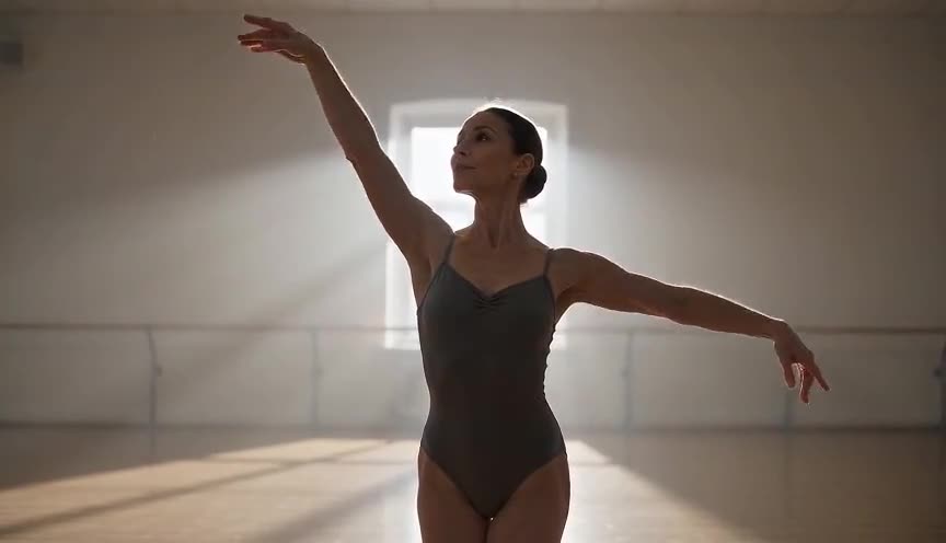
Figure-ground
Figure-ground composition is the visual separation of a subject (the figure) from its surrounding environment (the ground) so the eye instantly knows what to look at. It relies on contrast in tone, color, sharpness or depth to push the subject forward and let the background recede.

Tonal contrast
Tonal contrast is the deliberate difference in brightness and darkness between areas of a frame, used to separate a subject from its background and direct the eye toward the shot's focal point. It tells the viewer where to look before they consciously register anything else in the frame.

One-point perspective
One-point perspective is a composition where every straight line in the frame, from architecture, roads, or rows of objects, converges toward a single vanishing point, usually placed near the center of the image. It flattens depth cues into a strong funnel shape that pulls the viewer's eye straight into the frame.
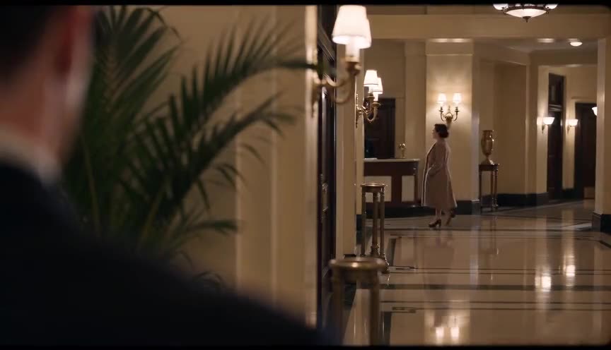
Dirty frame
A dirty frame is a shot where part of the lens is deliberately blocked by an out-of-focus object or figure in the foreground. It gives the image depth and texture and makes the viewer feel like they are peeking into the scene rather than watching it head-on.
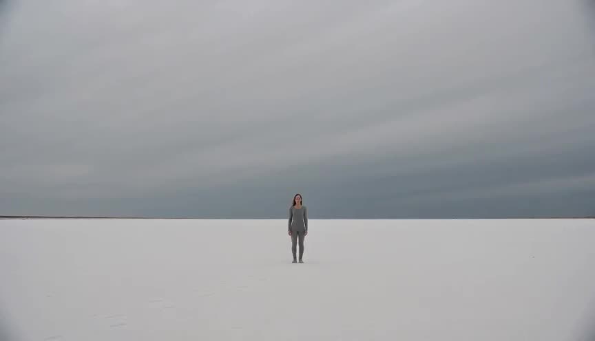
Clean frame
A clean frame is a composition stripped of visual clutter: no crossing background elements, no competing color, no stray motion near the subject. It lets the viewer's eye find the subject instantly and hold it without distraction.

Reflection shot
A reflection shot composes the frame so the audience sees a subject or scene through a mirror, window, puddle or other reflective surface rather than directly. It doubles the image, adds depth and often signals a psychological split, a watching presence or a moment of self-examination.
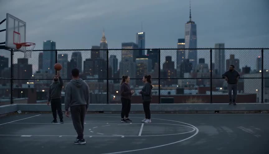
Tableau shot
A tableau shot is a static, wide or full shot in which actors and set elements are arranged deliberately within the frame, like figures in a painting, and the scene plays out without camera movement or cutting. It holds the viewer at a fixed distance, letting them read composition and staging rather than follow a moving point of view.
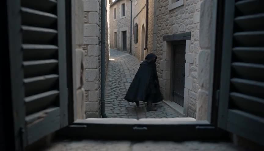
Voyeur shot
A voyeur shot frames the subject through a physical obstruction such as a window, doorway, foliage or shutters, as if seen by a hidden watcher rather than an open camera. It puts the viewer in the uncomfortable position of a spy, turning ordinary observation into an act of secret watching.
Frequently asked questions
What is the rule of thirds and why use it?
The rule of thirds divides the frame into a three by three grid, placing key subjects along the lines or intersections rather than dead center. It creates more dynamic, natural looking compositions than simply centering every subject.
When should I break symmetry instead of using it?
Use symmetry for order, calm, or formality, and break it with asymmetry when a scene needs tension, imbalance, or movement. A perfectly symmetrical frame can feel artificial or unsettling if the story calls for chaos instead.
What does negative space do in a composition?
Negative space is empty area around a subject that gives it room to breathe, emphasizes scale, or signals isolation and loneliness. It works by contrast, making the subject more noticeable precisely because so little else competes for attention.