Visual weight
Also calledCompositional weight, Eye weight, Balance of interest
Visual weight is the perceived importance or heaviness that an element carries within a frame, created by factors such as size, contrast, color, isolation and sharpness rather than actual mass. It tells the viewer where to look first and how balanced or unbalanced the rest of the composition feels.
What it tells
Visual weight lets a director control attention without cutting or moving the camera. A single dark figure against a bright field, or one sharp object among blurred ones, becomes the emotional center of the shot even if it occupies a small part of the frame. Filmmakers use it to build tension between elements, isolate a character's loneliness, or quietly announce who or what matters before any line is spoken. It is the silent grammar that decides where an audience's eye lands first and how it travels through the rest of the image.
How it is shot
Weight is built from several stackable cues: size (larger reads heavier), tonal contrast (a dark shape on a light field, or the reverse, reads heavier than mid-tones), color (warm, saturated hues pull more than cool, desaturated ones), sharpness (a single object in focus against a soft background wins), isolation (one object alone outweighs several crowded together), and position (the eye lands first on elements near the lower third or off-center on a rule-of-thirds line). A cinematographer balances these on set by adjusting subject placement, art department color choices, depth of field (a fast lens at f/1.4 to f/2.8 isolates focus), and lighting ratios, then checks the frame on a monitor to confirm the eye lands where the story needs it.
When to use it
- When a single prop or character must read as important without dialogue or camera movement to explain it
- When staging a group scene where one figure needs to dominate despite being smaller or further back
- When building tension between two elements of unequal size, color or sharpness within the same static frame
- When designing a poster-like key frame or tableau shot that must communicate hierarchy at a glance
Not to be confused with
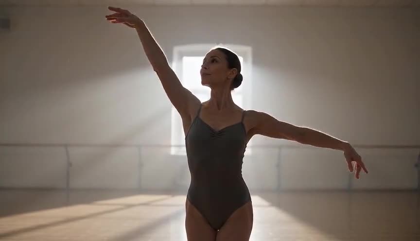
Figure-ground separates a subject from its background so the eye can distinguish the two; visual weight goes further, ranking every element in the frame by how strongly it pulls attention, background included.
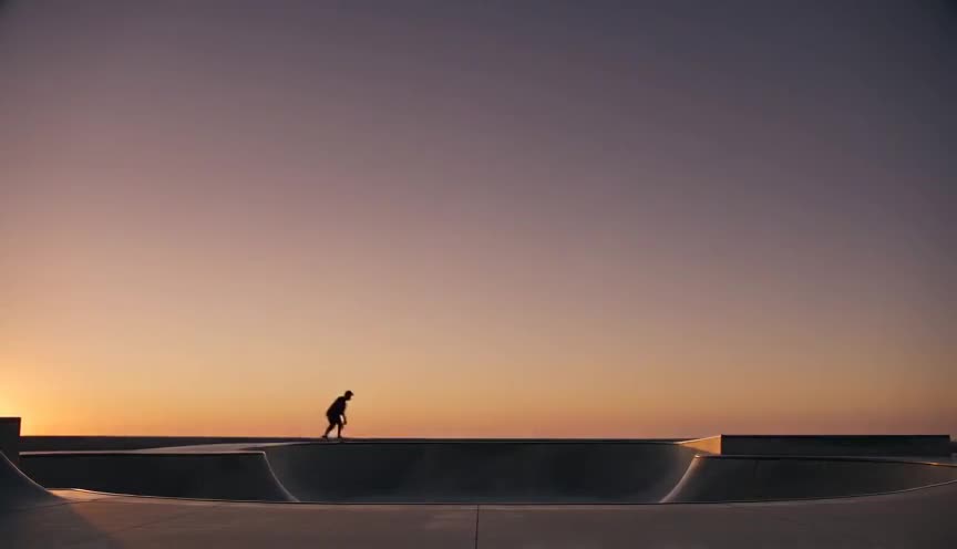
Negative space is one tool for creating visual weight, an empty area that makes a remaining object feel heavier by contrast; visual weight is the broader principle covering size, color, focus and position as well.
In film
Citizen Kane (1941)
Gregg Toland's deep-focus frames stack characters at different depths and sizes so the eye reads power and isolation purely from composition, without a cut.
There Will Be Blood (2007)
Paul Thomas Anderson repeatedly isolates a single dark figure against vast pale landscapes, using scale and tonal contrast to make one man outweigh an entire frame.
The prompt
Name the weight-carrying element directly (one dark object, one sharp figure) and its counterweight (a large area of light, blur or empty space). Specify the size relationship, the contrast (dark against light or the reverse), and whether it sits in focus while the rest is soft. Avoid asking for busy, symmetrical or evenly lit scenes, they flatten weight. Keep the camera static or nearly so, since movement can distract from the balance built within the frame itself.
The exact prompt that rendered the video on this page. Keep the description of the move, change the subject and the setting.
Visual weight, a static locked-off wide shot inside a glass greenhouse full of pale green seedlings under soft diffused daylight. A single large dark iron watering can sits in sharp focus in the left foreground, its heavy black silhouette contrasting against the bright, softly blurred wall of plants filling the rest of the frame. A woman in light beige clothing walks in slowly from the right background, small and pale against the glass, her figure acting as a light counterweight to the dark can. Camera does not move. No text.
Common mistakes
Confusing weight with size
Assuming the biggest object always wins; a small, sharp, high-contrast object can outweigh a large, blurry, low-contrast one in the same frame.
Cluttering the frame
Filling every part of the composition with detail so nothing has room to read as heavier, leaving the eye with no clear place to land.
Ignoring color temperature
Forgetting that warm, saturated colors carry more weight than cool, muted ones, so a small red object can dominate a much larger gray field.
Frequently asked questions
What is visual weight?
Visual weight is the perceived importance of an element within a frame, built from size, contrast, color, focus and position rather than actual physical mass, and it determines where the eye looks first.
Is visual weight the same as the rule of thirds?
No. The rule of thirds is a grid for placing elements at pleasing positions; visual weight is what makes any element, wherever it sits, feel heavier or lighter than the others around it.
Does color really affect visual weight?
Yes. Warm, saturated colors such as red or orange read as heavier than cool, desaturated ones, so a small warm object can outweigh a much larger cool or gray area in the same frame.
Can AI video tools like those on Imaginode render visual weight correctly?
Yes, if the prompt names the heavy element, its contrast or focus advantage, and the lighter counterweight explicitly, models such as Seedance, Kling, Veo, Wan or Grok Imagine can reproduce a believable weight balance.