Dystopian look
Also calleddystopic look, oppressive future look, authoritarian grade
The dystopian look is a genre grade that paints a scene as an oppressive, decaying future through desaturated color, hard institutional light and cluttered, worn production design. It signals to the viewer that the world on screen has broken down and that the people in it are controlled or surveilled.
What it tells
Directors reach for the dystopian look to make a setting argue against itself: clean technology sitting inside decay, order enforced through visible control. The grade strips warmth from skin and light so the audience reads the space as hostile before a single line of dialogue lands. It compresses backstory into atmosphere, telling us who holds power and who does not just by how a corridor is lit or how many bodies are packed into a frame. The look also primes tension, since a world this depleted feels one step from collapse.
How it is shot
Push the color grade toward cyan, olive or bleached steel and pull midtone saturation down 20 to 40 percent so skin looks slightly sick rather than healthy. Light with hard, uncolored sources from above or from practicals like flickering fluorescents and sodium vapor lamps, keeping fill low so shadows stay dense. Favor wide or ultra-wide lenses (18mm to 28mm) that let production design (rust, steam, wiring, propaganda-style signage, crowding) fill the frame, and shoot on longer lenses only for isolated, surveilled close-ups. Add practical smoke or steam, uneven exposure and a touch of grain or halation to break the digital cleanliness. Costume and set dressing carry as much weight as the grade: uniforms, rationed materials and worn surfaces sell the world before the camera moves.
When to use it
- Introducing a future or alternate society that runs on control, scarcity or surveillance rather than freedom.
- Showing a character trapped inside a system, workplace or city that grinds people down.
- Contrasting a small human moment against an oppressive, mechanized or institutional backdrop.
- Opening a film or episode to set genre expectations before any dialogue explains the world.
Not to be confused with
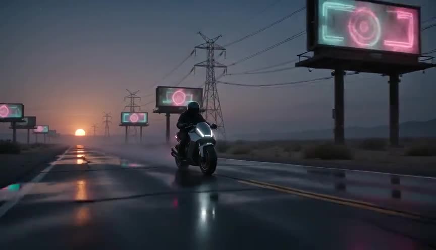
Cyberpunk leans into neon color and high-tech gloss layered over decay, while the dystopian look strips color out entirely to feel bureaucratic and worn rather than seductive.
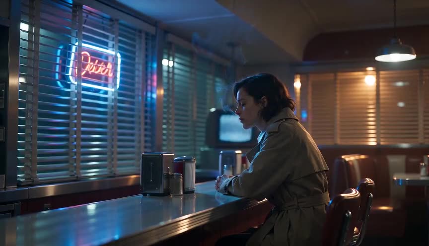
Tech noir borrows crime-thriller shadows and rain-soaked streets around advanced technology; the dystopian look is broader, applying its cold, controlled grade to any oppressive future setting, not just crime.
In film
Children of Men (2006)
Uses a desaturated, handheld, documentary grade and cluttered frames to make a near-future Britain feel exhausted and collapsing.
Blade Runner 2049 (2017)
Combines a bleached, cold palette with vast, depopulated interiors to show a controlled, atomized future society.
Brazil (1985)
Fills every frame with clutter, wide lenses and industrial machinery to make bureaucracy itself feel like a prison.
The prompt
Name the grade directly: desaturated, cold, institutional, bleached or olive-toned, and specify hard overhead or fluorescent light rather than soft key light. Describe worn, cluttered production design (peeling paint, exposed pipes, steam, uniform clothing) since AI models read set dressing as strongly as color words. Avoid words like futuristic or sci-fi alone, they default to clean neon cyberpunk; instead say oppressive, controlled, depleted. Keep skin tones slightly sickly rather than warm, and mention a wide lens to let the environment dominate the frame.
The exact prompt that rendered the video on this page. Keep the description of the move, change the subject and the setting.
Dystopian look: a static wide shot on an 18mm lens inside a cramped, steam-filled ramen kitchen where exhausted cooks in identical gray uniforms work under a single flickering overhead fluorescent tube. The color grade is pushed toward cold olive and steel, skin looking pale and sickly, shadows dense in the corners where exposed pipes and cracked tile show decay. Steam drifts constantly across the frame, a numbered badge hangs from each cook's collar, and no one looks up from the counter as the camera holds perfectly still for the full four seconds. No text.
Common mistakes
Only changing color, not light or design
Slapping a teal-green LUT onto a bright, tidy set doesn't read as dystopian; the light source, clutter and wardrobe have to carry the decay too.
Confusing dystopian with cyberpunk
Adding saturated neon signage turns the look seductive and stylish instead of oppressive; keep color desaturated and hard, not glowing.
Over-cluttering every frame
Packing every shot with debris and fog exhausts the eye and flattens contrast; reserve the heaviest decay for wide establishing shots and let some frames breathe.
Frequently asked questions
What is the dystopian look in film?
It's a genre grade that shows a broken-down, controlled future or alternate society through desaturated color, hard institutional light and worn, cluttered sets, so the world itself argues that something has gone wrong.
How do I make a scene look dystopian without going sci-fi?
Focus on control and scarcity rather than technology: uniforms, rationed goods, bureaucratic signage, surveillance angles and cold light work in a present-day setting just as well as in a spaceship.
What color grade fits a dystopian look?
Cold cyan, olive or bleached steel tones with reduced midtone saturation, around 20 to 40 percent below normal, so skin reads pale and slightly sick rather than warm and healthy.
Can I generate a dystopian look with AI video tools?
Yes, on Imaginode you can describe the desaturated grade, hard overhead light and worn production design directly in the prompt, and the model will render the cold, oppressive atmosphere without needing a color grading pass.