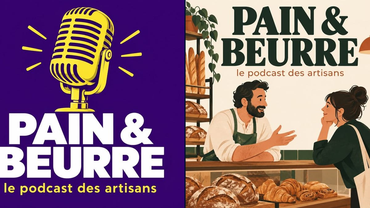
The baker starting a show
A baker wants to talk about his trade and his neighbours' shops, one episode a month. No designer, no budget: two covers for six credits, and he picks one with his partner over breakfast.
Two square covers for your podcast, a graphic microphone on purple and an illustrated scene, with the title and subtitle spelled correctly. Workflow visible here, no account needed.
Real workflow (demo in French): two square covers for a craftspeople's podcast called PAIN & BEURRE. One with a yellow retro microphone and a white title on purple, the other with a baker and a customer chatting across the counter, dark green title on cream.
At a glance
People pick a podcast by its cover first, as a thumbnail in a list. Plenty of shows start with a stock photo of a microphone and a thin font that nobody can read at that size. This workflow makes two square covers for your show, one graphic and one illustrated, with the title nice and big.
The hard part is legibility when small. A model left alone adds words, a tagline, a name, and it all blurs as a thumbnail. The prompt keeps two lines, title and subtitle, and forbids the rest. GPT Image 2.5 Sunburst writes them letter for letter, even white on purple.
If you also publish the filmed version, follow up with the YouTube banner and the thumbnail. Both covers cost six credits.
These are the files of the workflow above, exactly as the models produced them, unretouched. The starting point is shown when there is one.
Render
Podcasters launching a show, makers and businesses talking about their trade, community radio stations.
The show's title, a one-line subtitle and the topic, to choose the object or scene to illustrate.
Set the title
The show's name, short, plus one subtitle line that says what it is about. No guest names or episode numbers: they change every week.
Pick one strong image
A single object, a microphone, a mug, a tool, or a simple scene that shows the theme. One idea per cover.
Shrink it to judge it
Look at the render tiny, at phone thumbnail size. If the title stops being readable, make it bigger or simplify the background.
Upscale and publish
Podcast platforms want a bigger square than the render: run it through the Enhance node before you upload it.
The same canvas, tuned for different needs: each variation is two or three lines of prompt away.
A baker wants to talk about his trade and his neighbours' shops, one episode a month. No designer, no budget: two covers for six credits, and he picks one with his partner over breakfast.
The comms manager at a small firm launches a series of staff interviews. She tests a cover in brand colours and a more illustrated one, and shows both to the leadership team before deciding.
Two mates have talked films every Sunday for a year behind a homemade cover. They redo it for season two, with a title that can finally be read in the subscriptions list.
Every show on the schedule goes out as a podcast. The volunteer who runs the website makes one cover per show in a shared style, one base prompt with the title swapped each time.
A fitness coach records guided workouts. She wants a cover that stands out between two meditation podcasts: one strong image, two words, one bright colour that people remember.
A club records books read aloud for members with poor eyesight. One square cover per book, with the title very large, so it is easy to spot on their phones straight away.
Title, subtitle, tagline, host name, release schedule: as a thumbnail, none of it reads. Keep two lines and put the rest in the show description.
Delicate script lettering looks lovely large and disappears small. Ask for a bold title, very big, filling a good third of the square.
The cover is first seen at thumbnail size. Shrink the render before choosing: the simpler version often wins.
The render is about 1,250 pixels square, below the minimum the big platforms ask for. Run it through the Enhance node before uploading.
In the demo, yes: the title and subtitle are exact on both covers, ampersand included.
Not in this canvas, which starts from a blank page. For a cover with your face, start from a portrait with a model that keeps the photo, as in the album cover workflow.
Yes: write the title and subtitle in that language, in quotes. Proofread the same way.
Six credits, three per render on GPT Image 2.5 Sunburst at medium quality. A third direction, with another colour or object, costs three more.
Because it spells correctly and costs three credits a render, the cheapest in the catalogue. In the demo it also held a white title on dark purple without a single letter out of place.
A square of about 1,250 pixels. Apple Podcasts asks for 1,400 to 3,000 pixels on each side: upscale the render with the Enhance node and it stays sharp.
Yes, the same square works everywhere. For rights questions about generated images, see our article on commercial use.
Yes: keep the prompt and change the background colour, or add "season 2" in quotes. The show stays recognisable from one season to the next.
Make podcast cover art with AI
Use this workflowFree account, no card required. The workflow opens pre-filled in your canvas.
 GPT Image 2.5 Sunburst
 Nano Banana 2.1
 Recraft V4.1