The self-published novelist
She is putting her trilogy out on KDP and wants a map at the front of book one. The parchment version, turned greyscale, fits a 5 x 8 inch interior page, and the same image sits on the book's page on her website.
Two fantasy maps for your book, sepia parchment or watercolour, with your place names written letter for letter. Workflow visible here, no account needed.
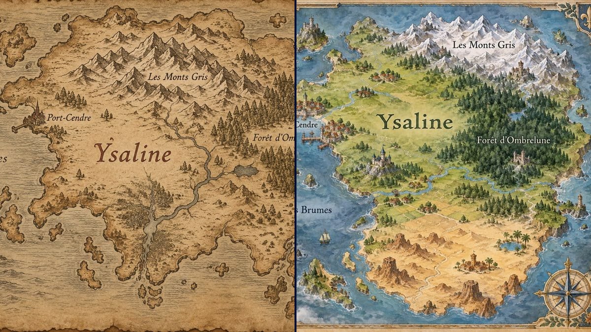
Real workflow: the invented continent of Ysaline, first in sepia ink on parchment with a compass rose and a sea serpent, then in watercolour with snowy peaks, castles, a walled harbour and a desert to the south. All five place names are correct on both maps.
At a glance
Fantasy readers open the book and look for the map before chapter one. Plenty of self-published authors put it off because a cartographer is out of budget, or sketch it in pencil in a notebook, and the world stays in their notes. This workflow gives you two maps of YOUR novel's continent: one in sepia ink on parchment, one in full-colour watercolour.
The hard part is the names. An image model happily covers a map in made-up, half-readable words that aren't yours. The prompt gives every place name in quotes and forbids anything else. Sunburst writes them letter for letter, accents and apostrophes included, but it draws the geography on its own: the coastline, the mountains, where the towns sit.
To fill that world, see the family coat of arms and the imaginary city; to dress it for the shelf, the book cover. Both maps cost six credits.
These are the files of the workflow above, exactly as the models produced them, unretouched. The starting point is shown when there is one.
Render
Fantasy novelists, self-published authors, writers putting together a series bible, game masters.
The place names in quotes, where they sit relative to each other, and the map style you want.
List your places
Five to eight names at most: the continent, a city or two, a mountain range, a forest, a sea. Beyond that the lettering shrinks and the map stops reading on a book page.
Say where they are
"Ashport on the west coast", "the Grey Mountains to the north". Without that, the model decides, and the map may contradict chapter three.
Pick the style
Sepia parchment for classic fantasy, watercolour for something brighter or for younger readers. The style lives in the first sentence of the prompt.
Proofread every name
Letter by letter, zoomed in. A stray flourish like the one above the "Y" in the demo takes two minutes to remove in any image editor.
The same canvas, tuned for different needs: each variation is two or three lines of prompt away.
She is putting her trilogy out on KDP and wants a map at the front of book one. The parchment version, turned greyscale, fits a 5 x 8 inch interior page, and the same image sits on the book's page on her website.
His series bible has to show producers where each arc plays out. The watercolour map, with the harbour and the mountains named, opens the world section of the document, ahead of the character pages.
She is running a homebrew campaign and wants a map for the table. She names only the regions the players already know and leaves the rest of the continent blank, to be discovered session by session.
His novel for 9 to 12 year olds is set on an invented island. The watercolour version, painted castles and bright colours, suits the endpapers and makes kids want to trace the heroes' route with a finger.
She posts an episode a week and readers keep asking where the cities are. A map posted at the start of the season, then redone with each new location, answers the comments and gets people talking again.
In the council scene, a map is unrolled on the table. The prop maker prints the parchment version large, ages it with tea, and the insert shot shows names that match the dialogue.
Twenty towns, six rivers and three kingdoms: the lettering shrinks and the mistakes pile up. Keep five to eight names per map and make a regional map for the detail.
Without "no other words", the model adds fake Latin captions, a cartouche with an invented title, towns you never wrote.
If your hero crosses the mountains eastward to reach the sea, the map has to allow it. Write where each place sits relative to the others.
Every render draws a different continent. Pick one and keep it for the whole series: a new generation won't give you the same coastline back.
In the demo, yes: "Ysaline" and the four French names, "Port-Cendre", "Les Monts Gris", "Forêt d'Ombrelune" and "Mer des Brumes", are exact on both maps. On the parchment, a small flourish hangs above the "Y" of Ysaline.
Partly: describe it, "a crescent-shaped continent", "two islands split by a strait". This workflow starts from a blank page, so it won't trace a sketch you drew yourself.
Yes, on the endpapers or before chapter one. The parchment version holds up in greyscale for a black and white interior; for print size, see upscaling an image for print.
Six credits, three per map on GPT Image 2.5 Sunburst at medium quality. One more map, a close-up of a single region for instance, costs three credits.
Because it spells correctly on a light background, and parchment or pale watercolour counts as one. It copies names with their accents and it's the cheapest model in the catalogue, which leaves room to try several styles.
The prompt asks for 4:3. In the demo, the parchment came out at 3:2, 1536 x 1024, and the watercolour almost square, 1312 x 1199. Crop to fit the page it will be printed on.
Yes, to illustrate your own novel. Amazon KDP asks you to disclose AI-generated images when you publish; for the rest, see the rules on commercial use.
Not by rerendering: each render redraws the continent. Fix the name in an image editor, or rerender and accept a new geography.
Make a fantasy map for your novel with AI
Use this workflowFree account, no card required. The workflow opens pre-filled in your canvas.
 GPT Image 2.5 Sunburst
 Nano Banana 2.1
 Recraft V4.1