The first film's company
A director sets up a small company to produce his first short and apply for grants. He needs a logo for the funding pack, the opening card and the letterhead on the contracts.
Your production company's logo in two versions: on black for the film's opening, on white for your paperwork, with the name spelled right. Workflow visible here, no account needed.
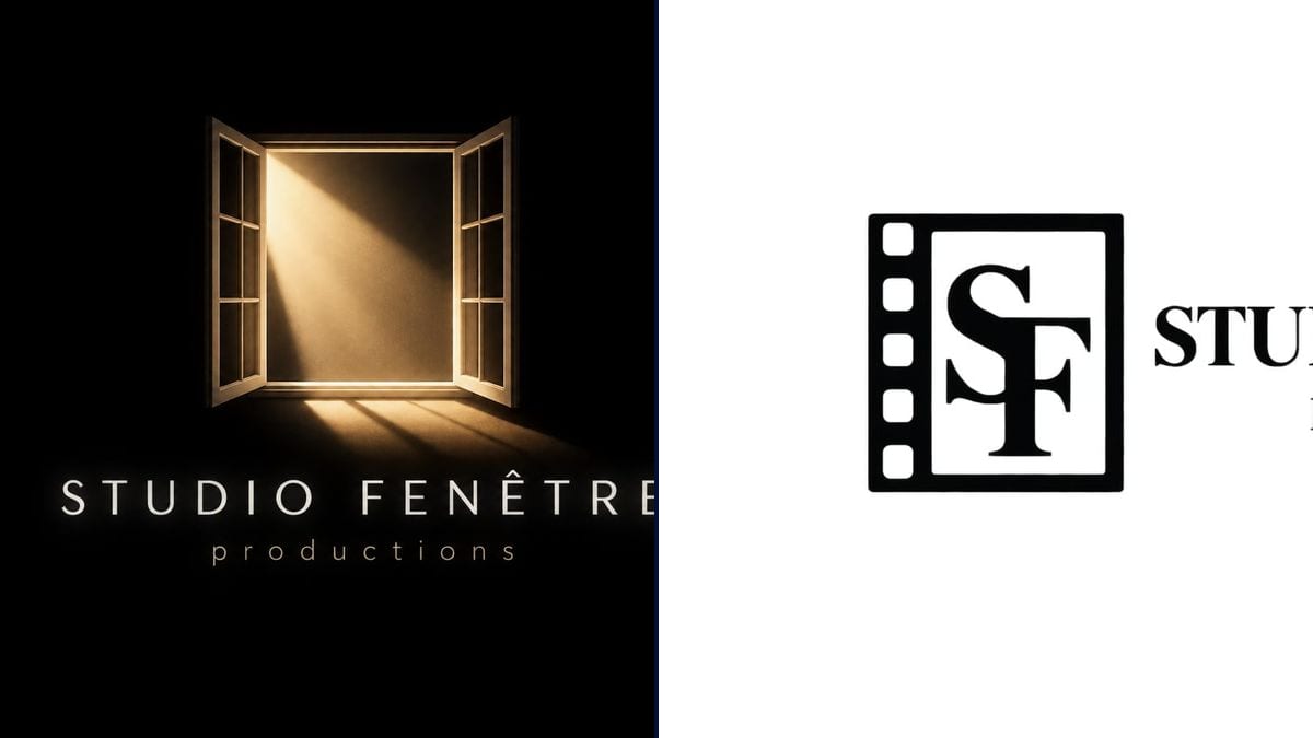
Real workflow: "STUDIO FENÊTRE productions" with an open window whose amber light falls on the floor, on black, then with an SF monogram in a film frame with sprocket holes, black on white.
At a glance
A short film almost always opens on a production card, and when you set up a company for your first film, that card is often a name typed in white in the editing software. Yet the logo ends up everywhere: credits, poster, funding pack, letterhead. This workflow gives you two versions: a glowing icon on black, ready for the opening of the film, and a black monogram on white for documents.
The hard part is covering both uses with the name spelled right. A model left alone crams the logo with reels and searchlights, and happily drops an accent. The prompt keeps one icon idea per version and the name in quotes. Sunburst writes it letter for letter; for the monogram, the prompt insists on the white background, which the model first rendered as transparent.
For a logo that has nothing to do with film, see the logo generator; for a made-up brand that appears inside your film, the fictional company logo. Both logos cost six credits.
These are the files of the workflow above, exactly as the models produced them, unretouched. The starting point is shown when there is one.
Render
Directors setting up a company, collectives, small production companies and AI filmmakers who sign their films under a studio name.
The company's exact name and the line below it, one icon idea, and the background: black for the screen, white for documents.
Write the exact name
The company name as it will appear in the credits, accents included, and the line below it: "productions", "films", "pictures".
One icon idea
A window for Studio Fenêtre, a lighthouse, an initial. One simple image that still reads small on a poster.
Name the background
Pure black for the opening card, plain pure white for documents. Write it down, or the background may come out transparent and then black.
Get it vectorised
For print and large formats, have the chosen logo redrawn as a vector by a designer or with a vectorising tool.
The same canvas, tuned for different needs: each variation is two or three lines of prompt away.
A director sets up a small company to produce his first short and apply for grants. He needs a logo for the funding pack, the opening card and the letterhead on the contracts.
The editor has to drop three seconds of logo before the first shot. The version on black goes straight onto the timeline with no masking, and the black blends into the fade.
An AI filmmaker releases a short every month under the same studio name. The monogram on white becomes the channel avatar, and the black version opens every film.
Three friends sign their films together and want a shared name in the credits. They try two icons and two typefaces in one evening, then vote on the images rather than on words.
A producer prepares the press kit of a film selected at a festival. The black-on-white monogram goes at the top of every page and next to the partner logos on the last one.
A small production company changes its name after ten years. Before paying a designer, the team compares several logo directions to know which one to brief.
In our tests, the monogram's transparent background showed up as black and the black logo vanished. Ask for a plain pure white background and cut it out later if needed.
Reel, clapperboard, searchlight and film strip in one icon: nothing reads small on a poster or at the bottom of the credits. One idea is enough.
Plenty of studio names already exist, some of them registered. Search your country's trademark database before printing it on all the film's material.
A render 1536 pixels wide is fine on screen, not on a banner or a plaque. Have the chosen version vectorised before any large print.
In the demo, yes: "STUDIO FENÊTRE" and "productions" are exact on both logos, circumflex accent included.
Because a production company needs both: a light logo on black for the screen, a dark logo on white for paper and funding packs.
Yes: start from the logo on black and bring it in during the edit, with a fade or the light switching on. For a fully animated title sequence, see the film credits workflow.
Six credits, three per logo on GPT Image 2.5 Sunburst at medium quality. A third direction, another icon or typeface, costs three more.
Because it spells correctly, accents included, and it's the cheapest model in the catalogue, so you can try plenty of directions. In the demo, it also holds white text on black.
The first renders had a transparent background, shown as black under a black logo. The prompt now names the white background twice, and the demo render comes out on white.
You can use it for your company. Registering a trademark is a separate step, and check that it doesn't resemble an existing logo. See commercial use of AI images.
16:9 landscape, around 1536 x 1024 pixels, like a film card. Crop it square for a social media avatar.
Make a production company logo with AI
Use this workflowFree account, no card required. The workflow opens pre-filled in your canvas.
 GPT Image 2.5 Sunburst
 Nano Banana 2.1
 Recraft V4.1