The science fiction corporation
A director is preparing a short about a company that controls a city's power supply. The black and silver logo goes on the extras' badges, the glass door of the lobby and the welcome screen at headquarters.
Two logos for companies that only exist in your film, a science fiction corporation and a family cannery from another era, names spelled right. Workflow visible here, no account needed.
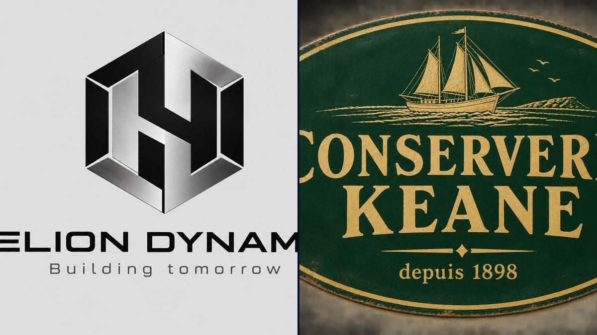
Real workflow: the black and silver HELION DYNAMICS logo, a hexagon that forms an H, on light grey, then the green and gold oval enamel sign of CONSERVERIE KEANE with a sailing ship, set on a dark background. Both came out at 3:2.
At a glance
The corporation pulling the strings, or the family factory where the hero works: plenty of scripts hinge on a company. It needs a logo for badges, vans, office doors and screens. Using a real brand is out, and so is a parody of one. This workflow designs two fictional brands: a science fiction corporation and an old cannery for a period film.
The hard part is looking real without reminding anyone of anything. An image model has seen thousands of logos and happily reuses their codes. The prompt describes the icon as simple shapes, sets the colours and rules out any resemblance to an existing brand. Sunburst writes the name and tagline letter for letter.
For your own production company's logo, use the production logo; to replace a real brand on a prop, the unbranded prop. Both logos cost six credits.
These are the files of the workflow above, exactly as the models produced them, unretouched. The starting point is shown when there is one.
Render
Production designers, on-set graphic designers, directors, novelists, AI filmmakers and game masters who need a brand that only exists in their story.
The company's industry and era, the icon as simple shapes, the colours, and the name and tagline in quotes.
Describe the company
Its industry, its era, its role in the story. A cold corporation and a family business from 1898 don't get the same design.
Give the icon as shapes
A hexagon, an oval with a ship, a circle and a star: simple shapes that are easy to reproduce in vinyl or paint on the set.
Write name and tagline
In quotes, the name and then a short tagline, a founding date or a house slogan. Nothing else.
Roll it out on the set
Badges, boxes, doors, van, welcome screen: the logo is the reference for the graphic designer or the art department for everything else.
The same canvas, tuned for different needs: each variation is two or three lines of prompt away.
A director is preparing a short about a company that controls a city's power supply. The black and silver logo goes on the extras' badges, the glass door of the lobby and the welcome screen at headquarters.
The set is an old Breton cannery for a 1930s drama. The enamel sign, printed on metal, is screwed above the door, and the same oval decorates the crates on the quay.
A novelist wants the company at the heart of his plot to exist on his cover and his website. The logo comes back on a fake press release and in the book trailer.
An AI filmmaker generates a dozen shots inside the company's offices. The logo, given as a reference image, shows up on the wall in every shot instead of being reinvented with each generation.
A game master is preparing the three corporations of a science fiction campaign. Each one gets a logo for handouts, fake business cards and the screens of the online session.
A series production has to wrap two vans for an invented delivery company. The logo is the mock-up for the sign maker, who redraws it as a vector before cutting the vinyl.
"Like that tech giant, but different" gives a logo that recalls the original, which is exactly what you're trying to keep off screen. Describe shapes, not a brand.
A name that sounds good is often taken, and "Helion" is. A web search plus a trademark database check takes five minutes.
Fine linework disappears on a badge shot from three metres away. Keep a simple icon and a readable name, like a real brand.
The render is an image, not a vector file. For a van wrap, a sign or large-format printing, have a designer redraw it as a vector.
In the demo, yes: "HELION DYNAMICS", "Building tomorrow", "CONSERVERIE KEANE" and "depuis 1898" are all exact.
Both demo logos came out at 3:2, 1536 x 1024 pixels, instead of the square asked for. The logo sits in the middle with plenty of margin, so crop it square if you need to.
No. The prompt steers away from obvious lookalikes, but the model checks no trademark registry. Search the name and see whether the icon recalls a known brand before you use it.
Six credits, three per logo on GPT Image 2.5 Sunburst at medium quality. A third company, or a variation on the same logo, costs three more.
Because it spells the name and tagline correctly and it's the cheapest model in the catalogue. On a light background, like the light grey sheet in the demo, it's at its best.
The prompt asked for cream; the model set the sign on a dark wall, which shows it off but doesn't follow the prompt. For a plain cream background, write "on a plain cream background, no wall".
This workflow makes set brands. For a real company, go through the logo generator, and for rights, see commercial use rules.
Not directly. Ask for a plain light background and cut the logo out, or have it redrawn as a vector for print.
Make a logo for a fictional company in your film with AI
Use this workflowFree account, no card required. The workflow opens pre-filled in your canvas.
 GPT Image 2.5 Sunburst
 Nano Banana 2.1
 Recraft V4.1