The bakery refit
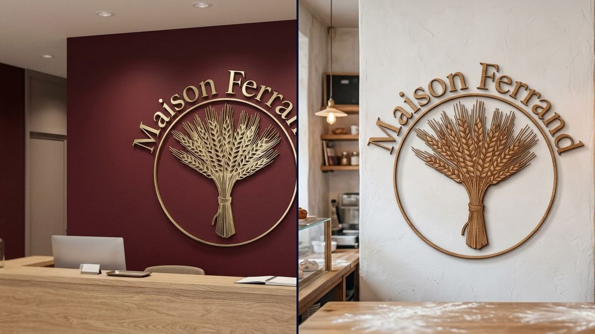
Two bakers are redoing the shop and can't choose between brass on a dark wall and oak on white. Two pictures, and the decision is made with the architect in one meeting.
Your logo as 3D letters on the reception wall, brushed brass on burgundy or oak on white plaster, to scale. Before you ask for a quote. Workflow visible here, no account needed.
Real workflow: the burgundy Maison Ferrand logo, a wheat sheaf in a circle, then the same logo in brushed brass on a burgundy wall behind an oak reception counter, and in cut oak on a white bakery wall.
At a glance
The logo behind the counter is the first thing a customer sees walking in, and it adds up quickly on an invoice. Picking material, size and wall colour from a flat drawing or a brass sample is guesswork. This workflow puts your logo on two reception walls, photo-real: brushed brass, then solid oak.
The hard part is scale and depth. A model left to itself makes the logo too big, too small, or flat as a sticker. The prompt gives the width in metres, the material, the mounting and its shadow, plus a counter or wall for reference. Nano Banana 2.1 builds the room around the logo and keeps the name spelled right.
For a glowing version, try the neon sign logo; to dress the whole space, home staging. Both walls cost fourteen credits.
These are the files of the workflow above, exactly as the models produced them, unretouched. The starting point is shown when there is one.
Starting point
Render
Shop owners refitting their premises, offices and firms fitting out a reception, sign makers and architects presenting a project.
The logo at a decent resolution on a plain background, the exact name in quotes, the material, the width and the wall colour.
Upload the logo
On a plain background, at a decent resolution, with the name clearly legible. The logo's outline is what gets cut.
Pick the material
Brushed brass, stainless steel, oak, painted PVC, acrylic. Add the wall colour too: contrast is what makes the logo.
Give the size
In metres, with a piece of furniture in front for scale. A one-metre logo reads differently above a counter than on a big bare wall.
Compare, then get a quote
Pick the version you like, then ask a sign maker for a price with the picture and the original logo file.
The same canvas, tuned for different needs: each variation is two or three lines of prompt away.
Two bakers are redoing the shop and can't choose between brass on a dark wall and oak on white. Two pictures, and the decision is made with the architect in one meeting.
A lawyer is setting up her practice and wants the name on the wall behind reception. She compares steel and brass, and sees whether the logo overwhelms the room or sits at the right size.
The firm presents a client's head office reception with the logo already in place. The render sits next to the drawings and shows how the depth and lighting will look.
A maker of cut letters attaches to every quote a picture of the client's logo on a wall, in the proposed material. The client sees what they are paying for instead of a sample.
New office, white wall at the entrance. The team votes between three materials on renders of its own logo before ordering the piece that will be in every team photo.
The owner wants her logo behind the chairs, where it shows up in every photo clients post. She tries light wood and brass on a wall in the colour she has in mind.
Without a width, the model decides and the logo fills the whole wall or floats there, tiny. Give a measurement and a reference piece of furniture.
Brass on a yellow wall or oak on wood panelling gets lost. Choose the wall colour together with the material.
Thin wheat ears or hairline letters cut badly and snap. If the logo is delicate, plan a backing plate or a simpler version with the sign maker.
Fixings, thickness, weight and lighting are worked out on site. The picture helps you choose; the sign maker measures and builds.
It is a believable estimate, not a measurement. The counter helps you judge, but only measuring the wall tells you the real size that fits.
The template starts from the logo alone and invents the room. For your real wall, also connect a photo of the reception to the Image node and ask for the logo to be placed on it with nothing else changed, then check the scale carefully.
No. They cut from the original logo file, ideally vector. The picture is for checking the look and the material.
Fourteen credits, seven per render on Nano Banana 2.1. A third material or wall colour costs seven more.
Because it takes your logo as a reference and builds the whole room around it, wall, counter, light, shadows, while keeping the name spelled right.
Flush letters are glued or screwed flat to the wall. Stand-off letters sit on spacers a few centimetres out and cast a shadow, like the oak in the demo.
Yes: ask for LED backlighting behind the letters or ceiling spots. Write it in the prompt.
4:3 landscape, wide enough to show the logo, the wall and the counter in front.
Preview your logo as reception wall lettering with AI
Use this workflowFree account, no card required. The workflow opens pre-filled in your canvas.
 Nano Banana 2.1
 Flux Kontext
 GPT Image 2.5 Sunburst