Blockbuster look
Also calledtentpole look, summer movie look, epic action grade
The blockbuster look is the polished, high-contrast visual style of big-budget action and adventure films: wide dynamic shots, teal-and-orange color grading, hard directional light and constant camera energy. It signals scale and spectacle, telling the viewer this story is bigger than life and worth the ticket price.
What it tells
Directors reach for the blockbuster look when a scene needs to feel like an event rather than a moment. The style borrows from theme-park ride design: constant motion, saturated contrast and larger-than-life framing keep the eye engaged and the pulse up, even during exposition. Teal shadows push skin tones warm so heroes read clearly against jungle, ocean or steel, and sweeping camera moves imply resources and control. Audiences associate the look with spectacle and craft, so studios apply it consistently across a franchise to signal scale and reassure viewers the story delivers on its promise of adventure.
How it is shot
The look starts with wide-angle lenses (14 to 24mm) on cranes, gimbals or drones that move constantly through a scene, exaggerating scale and parallax. Lighting stays hard and directional, often a single strong source (sun, HMI or practical fire) with heavy fill to keep shadows readable rather than moody. In the grade, shadows shift toward teal or cyan and skin tones push toward orange, boosting contrast and saturation well past naturalistic levels. Production design favors scale contrast: a small human figure against a vast set, vehicle or landscape. Score and sound reinforce the camera's momentum, but visually the technique lives in the combination of wide lens, moving rig, hard key light and the teal-orange grade applied in post.
When to use it
- Opening or closing shot of an action set piece that needs to feel massive and consequential.
- Establishing a hero against a vast landscape, vehicle or disaster to sell scale and stakes.
- Trailer cuts and key art moments where instant visual excitement matters more than subtlety.
- Franchise films that need a consistent, recognizable visual identity across sequels and marketing.
Not to be confused with
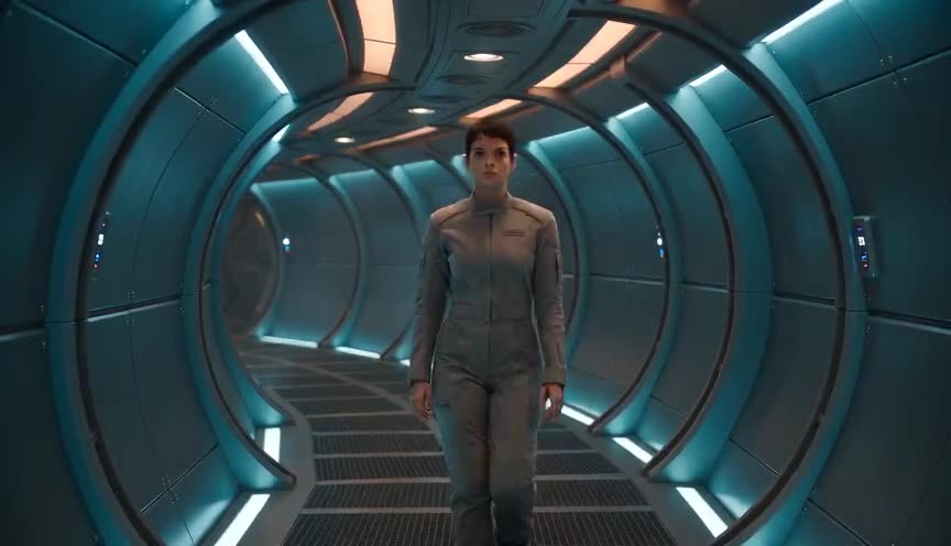
Teal-and-orange is the color grade at the heart of the blockbuster look, but it can be used alone in quiet, intimate scenes. Blockbuster look adds the wide lenses and camera energy that make the grade feel epic rather than just stylish.
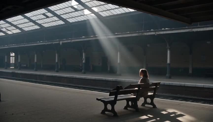
Arthouse look favors restraint, natural light and stillness that makes the viewer work for meaning. Blockbuster look does the opposite: constant motion, hard contrast and immediate legibility, built to entertain a mass audience in one pass.
In film
Avatar (2009)
James Cameron's alien jungle sequences use sweeping crane and aerial moves, saturated teal foliage and warm key light to make Pandora feel vast and dangerous.
Pirates of the Caribbean: The Curse of the Black Pearl (2003)
The franchise leans on teal seas against orange torchlight and skin tones, wide lenses and constant camera movement to sell swashbuckling scale.
The prompt
Name the lens and the move explicitly: 24mm or 18mm wide, crane or aerial arc, so the model reads scale rather than a static portrait. Say 'teal shadows, orange highlights' rather than just 'colorful,' and add a hard directional light source like sun or fire to keep contrast high. Push words like sweeping, epic, dynamic camera and avoid flat, even, soft light, which reads as documentary rather than blockbuster. Keep the subject small against a big environment to reinforce scale.
The exact prompt that rendered the video on this page. Keep the description of the move, change the subject and the setting.
Blockbuster look: a sweeping crane shot rises above a churning rainforest river as a lone adventurer steers a wooden boat through white rapids, shot on a 24mm wide lens that exaggerates the towering canopy and mist. The color grade pushes deep teal shadows against warm orange highlights on the boat and skin, hard sunlight cuts through fog in visible shafts, and the camera arcs right in one continuous motion, tracking the boat's speed while spray kicks up around the hull. No text.
Common mistakes
Grade without motivation
Pushing teal and orange onto every scene regardless of story, turning epic moments into generic noise and flattening the contrast that should be reserved for the biggest beats.
Flat, soft lighting
Using diffused, even light removes the hard shadows and rim separation that make the image feel large and dimensional, so the shot reads as flat television lighting instead of scale.
Static camera
Keeping the camera locked off removes the constant momentum that sells scale and energy, making the shot read as ordinary coverage instead of a big-budget spectacle moment.
Frequently asked questions
What is the blockbuster look?
It is the polished, high-contrast visual style used in big-budget action and adventure films: wide dynamic camera moves, hard directional light and a teal-orange color grade that make scenes feel epic and expensive.
Why do action movies use teal and orange so much?
Teal pushes backgrounds and shadows cool while orange keeps skin tones warm, so the human figure stays readable against explosions, water or foliage even in fast cuts and low light.
Can I get the blockbuster look with AI video generators?
Yes. Platforms like Imaginode can produce it if the prompt names the lens, the camera move and the teal-orange grade explicitly, since vague words like 'cinematic' alone rarely trigger the full look.
Does the blockbuster look work for quiet or dramatic scenes?
Rarely well. The style is built for scale and momentum, so it tends to flatten intimate or subtle moments; most films switch to softer, more naturalistic lighting for close character work.