The novel self-published on KDP
An author is formatting her paperback interior in Word. She generates the vignette with no text, places it at the top of all twenty-four chapters, and types the headings underneath as live text.
Two black ink chapter headers for your book's interior, an engraved vignette and a minimal rule, number and title spelled right. Workflow visible here, no account needed.
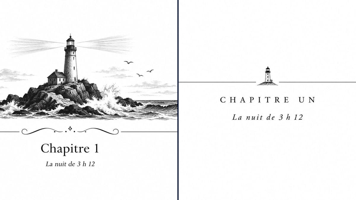
Real workflow: an engraved vignette of a lighthouse on rocks in the waves, a flourished rule and the French heading "Chapitre 1", then a thin rule with a small lighthouse in the middle and "CHAPITRE UN" in spaced capitals, italic subtitle below.
At a glance
You can often spot a self-published interior by its chapter openings: "Chapter 1" in bold, centred, and nothing else. Publishers add a rule, a vignette, an italic subtitle, and that's what makes the page look like a real book. This workflow gives you two black ink headers, an engraved lighthouse and a minimal version, in the world of your novel.
The hard part is printing. An interior prints in black on cream or white paper, and an ornament with greys, a background or a stray word shows up at every chapter. The prompt demands black only on pure white and quotes the text. Sunburst spells correctly on white for three credits an ornament.
For the outside of the book, see the cover and the back cover. Both ornaments cost six credits.
These are the files of the workflow above, exactly as the models produced them, unretouched. The starting point is shown when there is one.
Render
Self-published novelists formatting a KDP or print on demand interior, small presses, authors of story collections.
Your novel's motif, the chapter number and title in quotes, or no text at all for a reusable ornament.
Pick the motif
An object or place from your novel: lighthouse, key, raven, tower, quill. One motif that comes back at every chapter.
Decide on the text
Number in figures or words, with or without a chapter title. For a whole book, ask for the ornament alone, no text.
Stay black and white
Black ink, pure white background, lots of white space. That's what prints crisp on a KDP interior or at a printer.
Place it in your layout
Crop the extra white, then put the image at the head of each chapter in Word, Vellum, Atticus or your layout tool, at text block width.
The same canvas, tuned for different needs: each variation is two or three lines of prompt away.
An author is formatting her paperback interior in Word. She generates the vignette with no text, places it at the top of all twenty-four chapters, and types the headings underneath as live text.
The book splits into three parts and forty chapters. The engraving goes on the part pages and the minimal rule on chapter openings, with the same motif carried through.
Each story gets its own motif: a lighthouse, a rowing boat, a lantern. Same prompt, same engraving style, a different object, and the collection holds together from story to story.
A children's author wants livelier chapter openings without paying an illustrator for every page. One engraved vignette per chapter picks up the key object of that episode.
The publisher is launching an imprint with a shared interior style. The minimal rule, with a small motif swapped for each title, becomes the imprint's signature.
A retiree is writing his family's story for the grandchildren. An engraving of the old family house at the top of each chapter gives the print run a carefully made feel.
A black interior turns colour into muddy grey, and a colour interior costs far more on KDP. Stick to black ink only.
A heading inside an image can't be corrected, searched or picked up by the table of contents. For a whole book, ornament alone, text in the software.
A vignette wider than the text block runs into the margins and can be flagged at print. Size it to the text width, not the page.
An ornament stretched on screen looks sharp and prints soft. The render is 1536 pixels wide: at 300 dpi that's about 5 inches, so don't scale it up beyond that.
In the demo, yes: the French "Chapitre 1", "CHAPITRE UN" and "La nuit de 3 h 12" are exact, spaces around the "h" included.
No. Generate the ornament once, with no text, and type each chapter's number and title in your software. The book keeps a consistent layout.
The ornament does, as a light image. Chapter titles, though, must stay real text in the ebook, or the table of contents and navigation break.
Six credits, three per ornament on GPT Image 2.5 Sunburst at medium quality. A third motif, for another part of the book, costs three more.
Because it spells correctly on white, numbers and accents included, holds the black on white you ask for, and it's the cheapest model in the catalogue. For an element repeated through a whole book, that's the sensible choice.
The 16:9 you ask for comes out at 3:2, 1536 x 1024 pixels, with plenty of white. Crop around the ornament: at 300 dpi its width fits the text block of a 6 x 9 inch book.
The render is on white. On white or cream paper the white doesn't show in print; for transparency, cut it out with the background changer or your own software.
Yes, in your own book. Check your print platform's terms and read the rules on commercial use.
Make chapter header ornaments for your novel with AI
Use this workflowFree account, no card required. The workflow opens pre-filled in your canvas.
 GPT Image 2.5 Sunburst
 Nano Banana 2.1
 Recraft V4.1