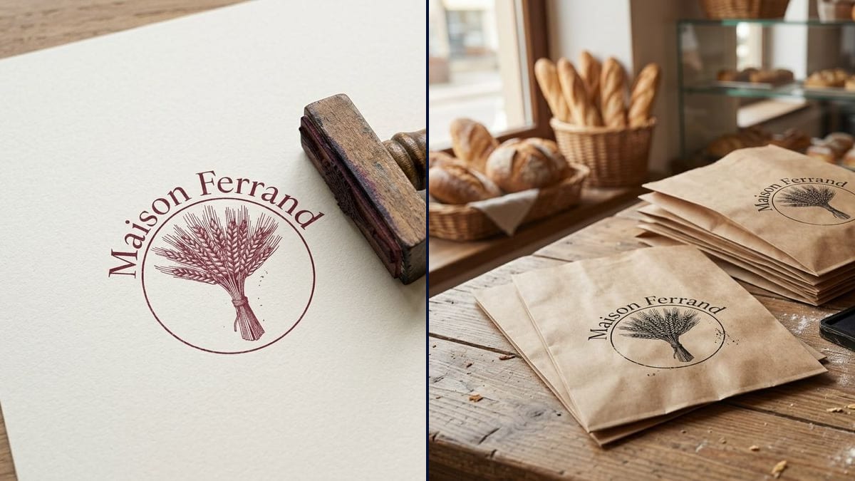
The bakery and its bags
The baker wants branded bread bags without paying to print thousands of them. He sees his logo stamped in black on kraft, then orders a single wooden handle stamp.
Your logo as a one-colour stamp: the print on paper next to a wooden stamp, then on kraft bags. Check it stays readable before you order. Workflow visible here, no account needed.
Real workflow: the burgundy Maison Ferrand logo, a wheat sheaf in a circle, then its burgundy print on cream paper beside a wooden stamp, and kraft bags stamped in black on a bakery counter.
At a glance
A logo stamp is the cheapest way to brand bags, loyalty cards or boxes. But a logo designed for screens doesn't always survive as a stamp: thin lines fill in, curved text goes mushy. This workflow shows you the print before you order, on paper and on kraft bags.
The hard part is going down to one colour without losing the drawing. A model left to itself prints the logo like a laser printer, crisp and perfect, which tells you nothing about the real thing. The prompt asks for slightly uneven ink and lists every part of the logo. Nano Banana 2.1 keeps the name spelled right and the wheat ears readable.
For the matching box, see the packaging box mockup; for the card you stamp, the loyalty card. Both renders cost fourteen credits.
These are the files of the workflow above, exactly as the models produced them, unretouched. The starting point is shown when there is one.
Starting point
Render
Bakers, cafés and small shops branding their bags, makers packing orders, couples planning a handmade wedding.
The logo at a decent resolution on a plain background, the exact name in quotes, the ink colour and the surface to stamp.
Upload the logo
On a plain background, at a decent resolution. A stamp prints one colour only, so a logo in flat shapes gives the most realistic result.
Pick the ink
Black, burgundy, navy, green: one colour per prompt. The surface matters too: cream paper, kraft, card.
Quote the name
Along with every part of the design. That is what keeps the letters right along the curve.
Check readability
If the thin lines fill in on the picture, they will on the real stamp. Simplify the logo before you order.
The same canvas, tuned for different needs: each variation is two or three lines of prompt away.
The baker wants branded bread bags without paying to print thousands of them. He sees his logo stamped in black on kraft, then orders a single wooden handle stamp.
She ships orders in kraft pouches with small cards. The render shows whether her delicate logo still reads on a four-centimetre stamp, or whether she needs a simpler version.
The manager wants a logo stamp to mark coffees on loyalty cards. The print on cream paper shows what size to order so it fits inside one box on the card.
A couple has a monogram and wants to stamp it on envelopes, favour bags and menus. They check how it looks in burgundy ink on cream paper before ordering the stamp.
The coffee bags are kraft and the beans change every week. A logo stamp and a handwritten label are enough, and the picture shows how it looks on the bag.
A teacher had her students design a logo for their writing club. She sees the drawing as a stamp on paper before getting it made to mark their notebooks.
Hairlines fill in with ink. If the picture shows a mushy drawing, thicken the lines or make the stamp bigger.
A stamp lays down one solid colour. A gradient turns into a blot. Ask your designer for a one-colour version.
Kraft soaks up ink and every impression is a little different. That is why the prompt asks for an uneven texture.
The plate is cut from the original logo file at the exact stamp size. The picture only helps you decide.
The name and the drawing, yes. In the demo the sheaf lies sideways on one bag and the wooden stamp's base is too narrow for the print, so look at each render.
Yes: describe the stamp in the prompt, the base shape, the handle, a self-inking model.
No. The plate is made from your original logo file, ideally vector. The picture is for checking the look.
Fourteen credits, seven per render on Nano Banana 2.1. Another ink or another surface costs seven more.
Because it starts from your file and builds the scene around it, paper, bags, wooden stamp, while keeping the name spelled right and the fine detail of the sheaf.
A dark ink, black or burgundy, shows best on brown kraft. Light colours almost vanish. Try them on the picture first.
The picture gives no measurement. Allow at least three to four centimetres for a logo with curved text, and check with the maker using your file.
4:3 landscape, the framing of a product shot on a table or counter.
Preview your logo as a rubber stamp with AI
Use this workflowFree account, no card required. The workflow opens pre-filled in your canvas.
 Nano Banana 2.1
 Flux Kontext
 GPT Image 2.5 Sunburst