The letter found in the attic
In the adaptation of "North of Silence", the heroine finds a letter from her great-grandfather. The props master prints the 1891 letter on heavy paper, folds it in four and slips it into a tin box.
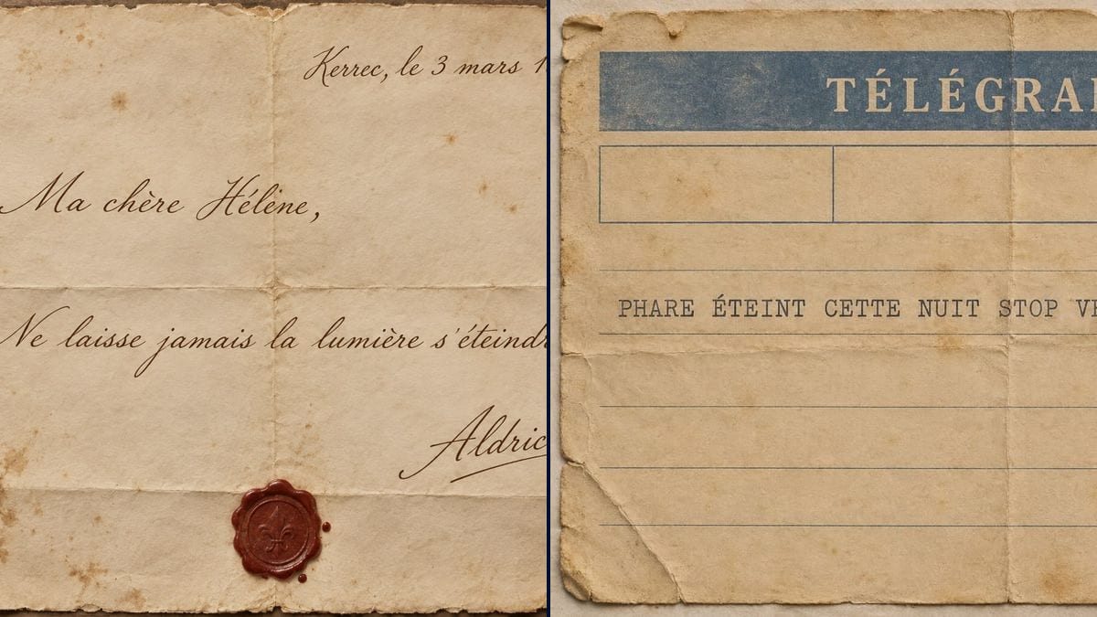
An 1891 fountain pen letter with a wax seal and a typewritten telegram, with your scene's text copied word for word. Workflow visible here, no account needed.
Real workflow: a letter on torn cream paper, dated Kerrec 3 March 1891, signed Aldric and closed with a red wax seal, then a yellowed telegram with a blue banner, the message typed in capitals and a "KERREC 1954" stamp. The demo text is in French.
At a glance
The letter found in a drawer, the telegram that arrives at the worst moment: these props often carry a whole line of dialogue, and the camera frames them in an insert so the audience can read it. Props teams write them by hand or set them in a font that looks wrong. This workflow gives you two period pieces, an 1891 fountain pen letter with its wax seal and a typewritten telegram.
The hard part is getting old handwriting that stays readable, and text that doesn't drift. The prompt places each line, the date, the greeting, the sentence, the signature, and forbids adding any. Sunburst copies them letter for letter, accents included, for three credits a piece.
For the newspaper from the same story, see the fake newspaper; for a card sent from far away, the vintage postcard. Both pieces cost six credits.
These are the files of the workflow above, exactly as the models produced them, unretouched. The starting point is shown when there is one.
Render
Props masters, production designers, period film directors, AI filmmakers, authors preparing a book trailer.
The exact text to read, place and date, greeting, sentence and signature, plus the period, the handwriting and the state of the paper.
Write the scene's text
Place and date, greeting, one or two sentences, signature. Only what the audience has to read: an insert lasts three or four seconds.
Pick the hand and the period
Fountain pen cursive for the 19th century, a typewriter for a telegram or an official letter, brown or black ink.
Describe the paper
Folds, stains, torn edges, wax seal: name every detail in the prompt. Otherwise the paper comes out as clean as a new sheet.
Proofread before printing
Every word, every accent, the punctuation. In the demo a small space slipped in before a full stop: rerun it if the insert is tight.
The same canvas, tuned for different needs: each variation is two or three lines of prompt away.
In the adaptation of "North of Silence", the heroine finds a letter from her great-grandfather. The props master prints the 1891 letter on heavy paper, folds it in four and slips it into a tin box.
In a period drama, the telegram arrives in the middle of a family meal. The director wants the message readable in one shot: a single typed line in capitals, with its STOPs, does the job.
She needs a letter insert, the kind video models spell badly. She makes the letter here, then animates it in a video node, a hand unfolding it or a candle flickering over it.
A novelist wants to show the letter at the heart of her plot in her trailer. The handwritten letter becomes the opening shot, without giving away more than the one sentence she picked.
To dress an 1890s study, the designer wants letters on the desk blotter. Same prompt, different texts, and background letters nobody will read up close.
The letter goes from hand to hand on stage and the front row can see it. The company prints the fountain pen version on A4 and ages it with tea so it lasts the whole run.
A full page of cursive can't be read in an insert and multiplies the chances of a typo. Keep three or four lines, the heart of the scene.
If a name has an accent, like Hélène, type it in the prompt: the model copies exactly what you give it, capitals included.
A bare date looks modern. A period letter opens with the place and the date at the top right: "Kerrec, 3 March 1891".
A prop has no business copying a real logo or a real government stamp. Invent the header and the postmark, as in the demo.
In the demo, yes: every word of the letter and the telegram is exact, accents included. The only slip is a small space before the full stop in the letter.
Yes, because the prompt asks for only four lines. A full page of tight cursive quickly becomes illegible, on screen and for the model.
The prompt doesn't ask for one: the telegram has no logo or official emblem, only an invented header and stamp. Keep it that way for a prop.
Six credits, three per render on GPT Image 2.5 Sunburst at medium quality. Another letter from the same character costs three more.
Because it spells correctly on a light background, in cursive and in typewriter type, accents included, and it's the cheapest model in the catalogue. The cream paper of an old letter suits it well.
The prompt aimed for portrait, but both pieces came out landscape: the letter at 1374 x 1145 pixels, the telegram at 1536 x 1024. For a letter folded in four, landscape works too.
Yes: ask for "a plain red wax seal with the initial A" or "no pattern". The model chose the fleur-de-lis on its own; the prompt didn't ask for it.
Yes: replace the quoted lines with the text in your story's language, accents and all. Keep the same structure: place and date, greeting, sentence, signature.
Make an old letter prop for film with AI
Use this workflowFree account, no card required. The workflow opens pre-filled in your canvas.
 GPT Image 2.5 Sunburst
 Nano Banana 2.1
 Recraft V4.1